Choosing the Right Watercolor Paper – My Recommendations After Countless Paper Tests
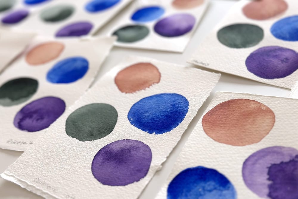
When you start out with watercolor, you quickly meet the same advice everywhere: 300 gsm, 100% cotton, and ideally a paper by Arches or Hahnemühle. Well – not so fast. For a long time I believed that heavy cotton paper was automatically the best choice, too. After many years and countless paper tests, I see things a little differently today, and here I'll share my absolute favorites.
For me, the decisive question is no longer:
Which paper is considered the best?
But rather:
Which paper makes painting easier and helps a picture succeed?
Why the paper decides whether a painting works
Beginners in particular tend to blame their own technique for many of their difficulties. In truth, the cause often lies in the paper. It determines how long water stays on the surface, how colors flow, how vividly pigments appear, and whether hard blooms – those unwanted backruns – form. A good paper can make painting more pleasant and forgive small mistakes. An unsuitable one, by contrast, can frustrate even experienced painters.
How a change in manufacturing changed my mind
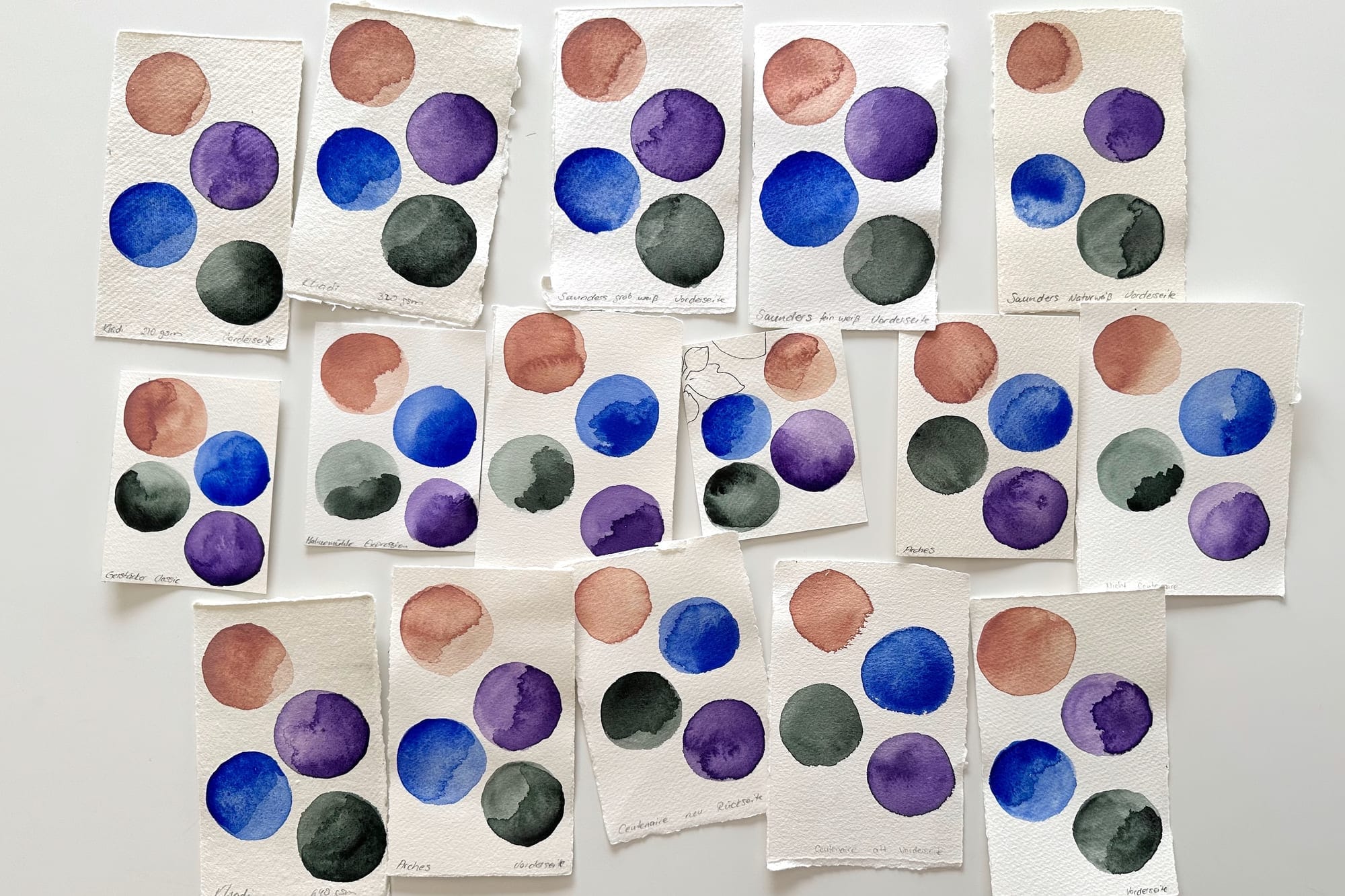
For a long time I was convinced that composition mattered most of all. Until my favorite paper was reformulated. The manufacturer switched to a vegan sizing. The weight and cotton content stayed the same – and yet the paper suddenly behaved completely differently. The colors looked noticeably paler, gradients became harder to achieve, and blooms appeared far more quickly. The sudden wave of negative reviews from other artists suggested they had run into much the same thing.
When I set out to find a replacement, I discovered that even papers from the most renowned makers – Arches or Hahnemühle – don't automatically guarantee that no blooms will form, or that colors will stay just as vivid once dry. That was quite a bitter disappointment, not least because these were among the most expensive papers on the market. And so I learned that cotton and weight alone are no guarantee of beautiful results. That experience fundamentally changed the way I see watercolor paper.
Sizing matters at least as much as the cotton
Today I'm convinced that the surface sizing – and with it the manufacturing process – is at least as important as the paper's composition. It governs how quickly water is absorbed, how long colors stay workable, and how softly transitions form. Two papers can look almost identical on the label and still behave completely differently under the brush.
My surface: fine and Cold Pressed
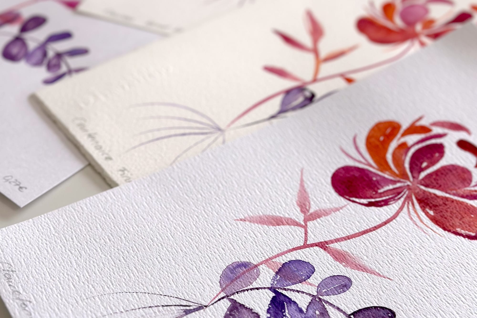
The surface matters a great deal to me, too. For botanical motifs I prefer a fine Cold Pressed surface. Coarse, heavily textured papers feel unpleasant to me while I paint and constantly pull my eye toward the paper's texture rather than the flower. As I'm neurodivergent, I perceive tactile and visual impressions especially intensely. A fine surface lets me focus entirely on the act of painting and work out the delicate shapes of blossoms and leaves.
Hot Pressed papers, by contrast, never really won me over. That smooth surface looks tempting at first, but in my experience colors dry down on it much faster. This leaves less time for soft gradients and harmonious transitions. And I've yet to find a Hot Pressed paper on which colors develop the same luminosity as on a good Cold Pressed sheet.
Bright white or natural white?
Another point that's often overlooked is the paper's white tone. Many watercolor papers come in a warm natural white, others are almost bright white. Before I start painting, I often find warm white paper more pleasant and harmonious. But the moment color comes into play, my impression shifts. On bright white paper, pigments appear noticeably more radiant and full of contrast. Especially for floral motifs, where I want to preserve the luminosity of the blossoms, I therefore almost always reach for a bright white paper. Warm white, on the other hand, can suit landscapes or atmospheric nature scenes beautifully, where a slightly more muted color effect is even welcome.
My two papers – two jobs
After many tests, I now deliberately work with two different papers.
The first is a very inexpensive cellulose paper of just 200 gsm (around 90 lb). By the classic recommendations it shouldn't even be among my favorites. And yet I love this paper. The colors glow surprisingly intensely, it costs so little that I can experiment without a guilty conscience, and although it buckles a little more as I paint, it flattens out again easily after drying if I leave it overnight under a few heavy books.
Of course, blooms form on it more readily. But that barely bothers me any more. On the contrary: with loose, free or slightly more abstract floral motifs, those runs are allowed to become part of the picture. Not every edge has to be controlled. Sometimes that is exactly what brings a watercolor to life.
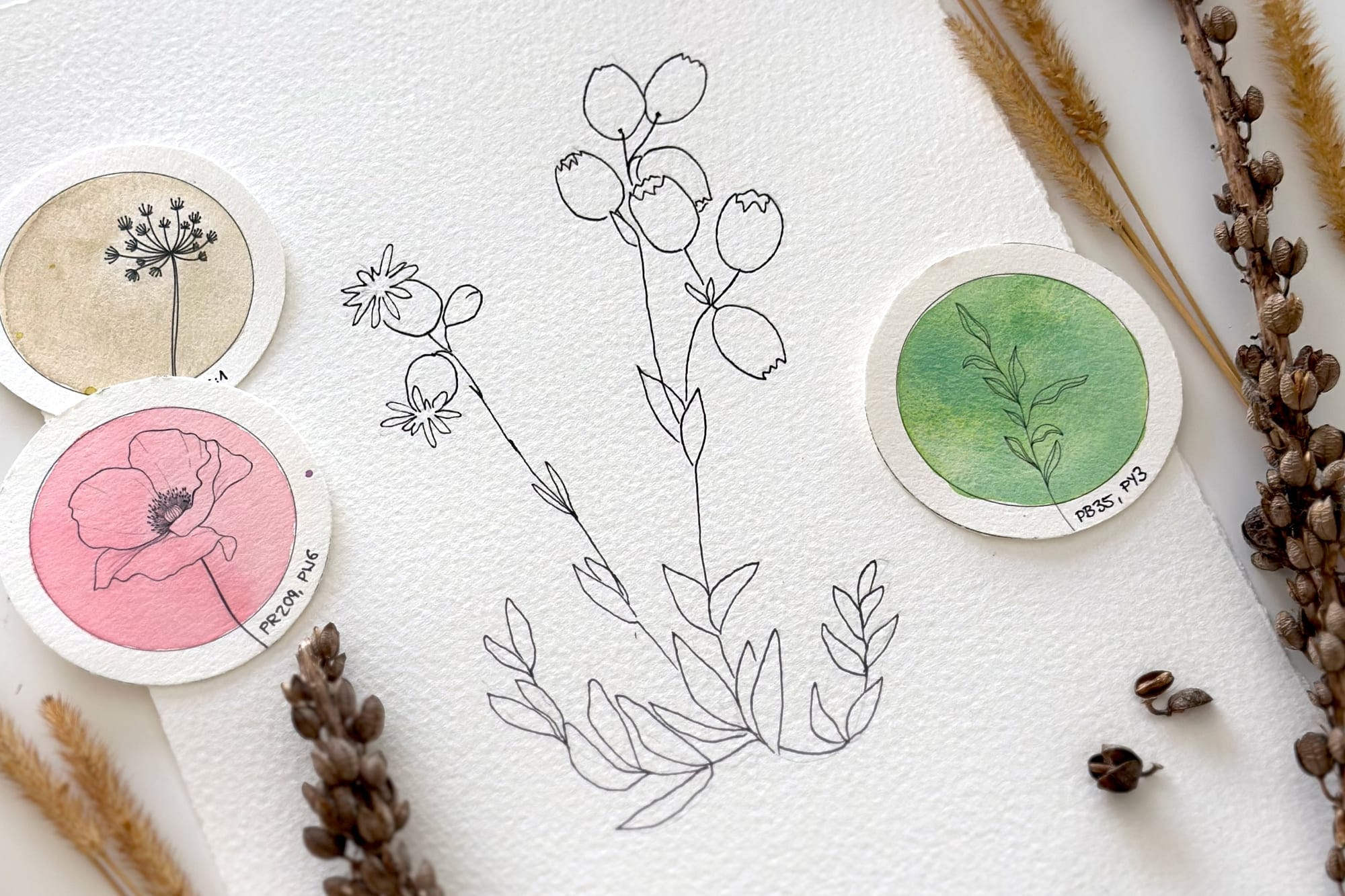
For my botanical painting templates I use a high-quality 100% cotton paper (300 gsm / 140 lb) with a sizing that suits my wet, water-rich way of working perfectly. It holds the water longer on the surface, colors stay workable for longer, and the pigments look exceptionally brilliant. Above all, this paper forgives many typical beginner's mistakes. That is precisely why I print my painting templates on it. Not because it's luxurious, but because it raises the odds that the picture will succeed.
My conclusion
So when someone asks me for a recommendation today, I don't point them to the most expensive artist's paper. I recommend two papers with two different jobs: an inexpensive paper with unbeatable value for money, on which you can practice and experiment without fear. And a high-quality paper for special painting sessions, when you want to experience just how lovely watercolor can feel.
I no longer believe in the one perfect watercolor paper. I believe in paper that suits your own way of painting.
Paper that makes you want to pick up the brush. And paper that supports the creative process instead of making it unnecessarily hard. Because in the end, the material shouldn't take center stage. It should help you bring the beauty of a flower onto paper with joy – and as little frustration as possible.
My two papers
After many tests, these are the two papers I mainly use today. They aren't sponsored recommendations – I buy both myself and recommend them simply because they've proven themselves in my own work over many years.
An inexpensive cellulose paper of just 200 gsm – the Gerstaecker N°3 watercolor pad (a European house brand, available from Gerstaecker within the EU).
A high-quality 100% cotton paper – Saunders Waterford High White (300 gsm / 140 lb, Cold Pressed). This links to the handy 12×16in block – it also comes in other sizes and as loose sheets.
One last tip: as a rule, larger loose sheets work out cheaper than bound pads once you work out the price per square meter. And paper tears cleanly by hand – so you can easily split a sheet into smaller pieces and buy more affordably.