Mixing Watercolors – The Basics for Luminous Flowers and Botanical Motifs
When you start out with watercolor, sooner or later you come across the color wheel. Honestly, at first I saw it more as dry theory. After all, I wanted to paint flowers, not catch up on art class.
Today I fall back on exactly these basics for almost every motif. Not because I have memorized the color wheel, but because it explains why some color mixes glow at once while others suddenly turn gray or muddy. The better I understood how colors react with one another, the more intuitive mixing became. And that is exactly what I wish for beginners, too.
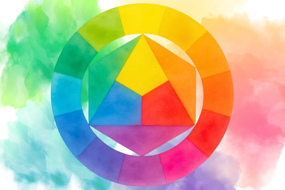
Primary colors, secondary colors and the color wheel
Every color can be traced back to three primary colors: yellow, red (or magenta) and blue. These colors cannot be created by mixing other colors.
Mix any two primaries and you get the secondary colors. Yellow and blue make green, yellow and red make orange, and red with blue makes violet. Combine primary and secondary colors after that, and the many tertiary colors appear – such as yellow-green, blue-green or red-violet.
The color wheel, then, is not dry theory but a map. It shows which colors harmonize, which reinforce one another and which cancel each other out. Once you understand these relationships, you will no longer mix colors by chance, but use them deliberately.
Understanding warm and cool colors
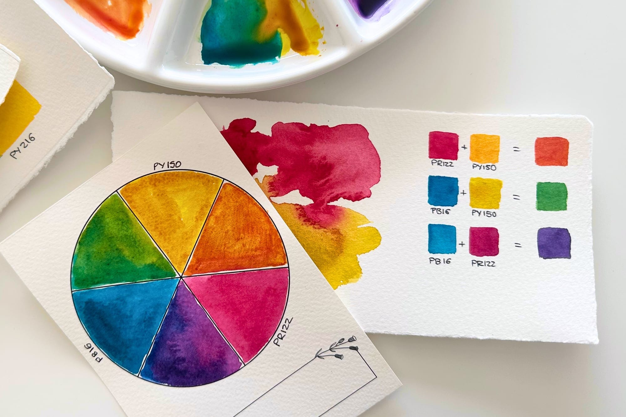
Over time I have found that the color wheel alone does not explain everything. Because every primary color comes in a warm and a cool version. A warm yellow has a slight orange cast, while a cool yellow leans a little toward green. The same goes for warm and cool blues and for warm and cool reds. These small differences decide which mix you end up with.
If I want to create a fresh, luminous spring green, for example, I combine a cool yellow with a cool blue wherever possible. Both colors sit closer together on the color wheel and contain no pigments that neutralize each other.
A warm yellow together with a warm ultramarine, by contrast, often gives a much more muted olive green. Both can be beautiful – what matters is the mood the picture is meant to carry.
The same is true for violet. A cool magenta with a pure ultramarine gives a clear, brilliant violet. But if the blue already has a green component, or the red an orange cast, you quickly get a warmer aubergine purple. It was precisely this experience that first got me to look more closely at pigments.
Complementary colors – not just for mixing
Among the most important basics of color mixing are the complementary colors. They sit directly opposite each other on the color wheel. Red and green, blue and orange, or yellow and violet neutralize one another. Mix them directly and you get grays, browns or earth tones. For landscapes, tree bark or natural shadows, these mixes are often ideal.
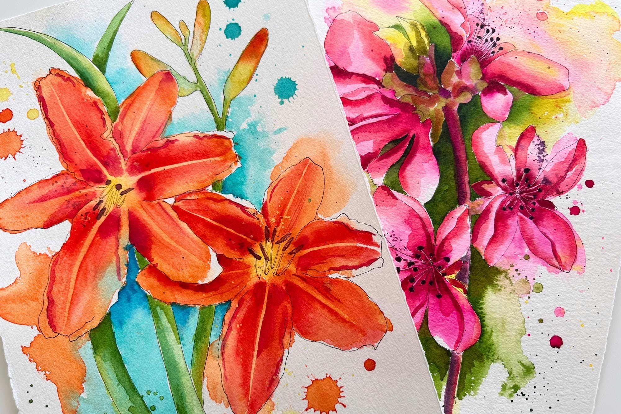
For botanical motifs, though, I mostly avoid mixing complementary colors directly when I want to preserve the luminosity of a blossom. Instead, I use the color wheel in a different way: I deliberately place complementary colors next to each other.
If I paint a violet blossom, for example, the background often gets a warm yellow tone. Red blossoms look especially intense against a green background, and orange blossoms gain radiance from cool blues.
The colors are not mixed here – they reinforce one another. The blossom stands out more and looks more alive, even though its actual color has not changed at all. So the color wheel does not only help with mixing colors, but also with creating harmonious and effective compositions.
Watercolors also mix on the paper
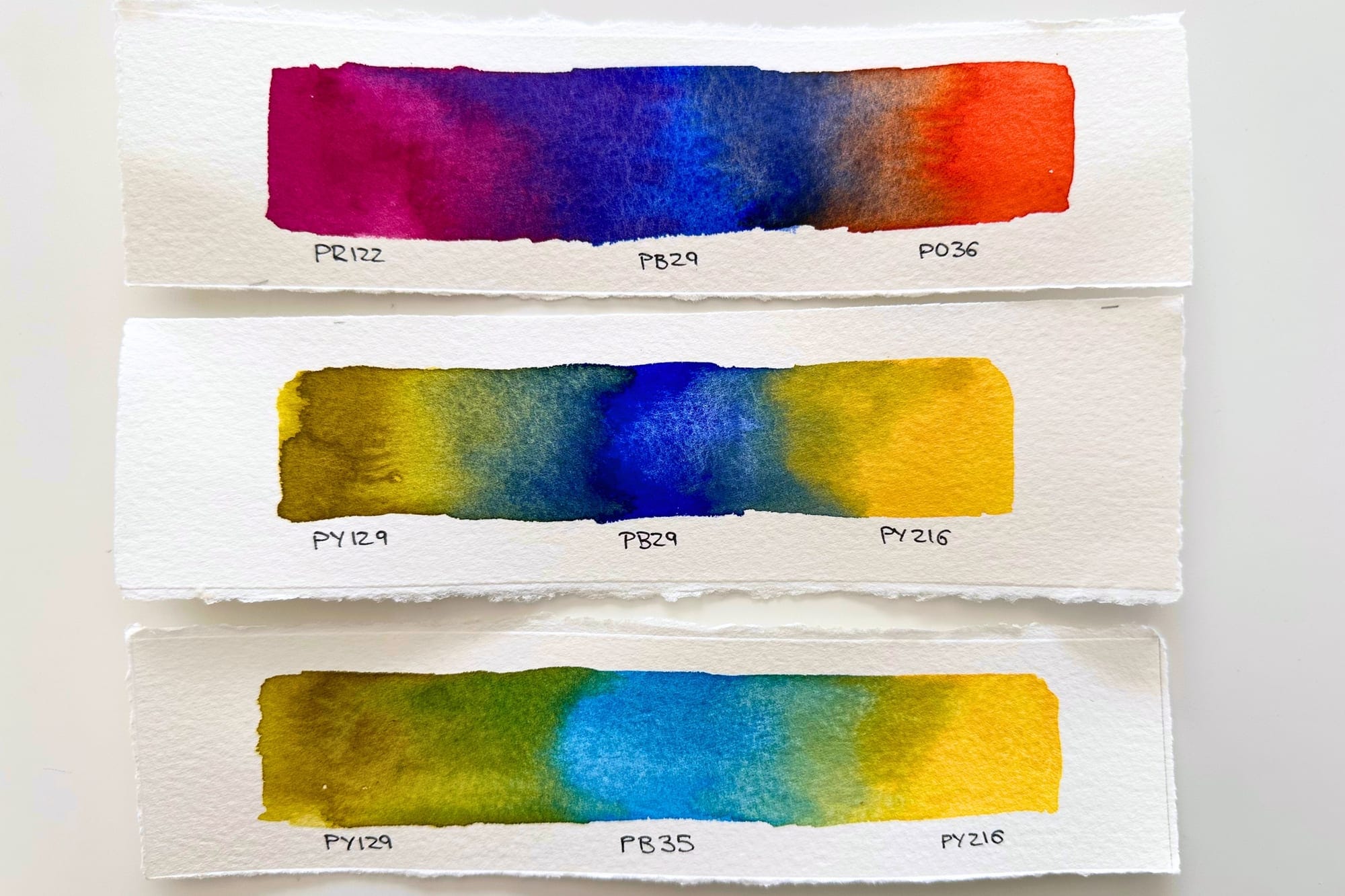
Perhaps the biggest difference from other painting techniques is that watercolors do not only mix on the palette. On damp paper, pigments begin to flow. They meet, partly separate again, and form new gradients all by themselves. That is exactly why one of the most important sentences in watercolor painting is: Know your pigments. The better you know your pigments, the better you can predict how they behave on the paper.
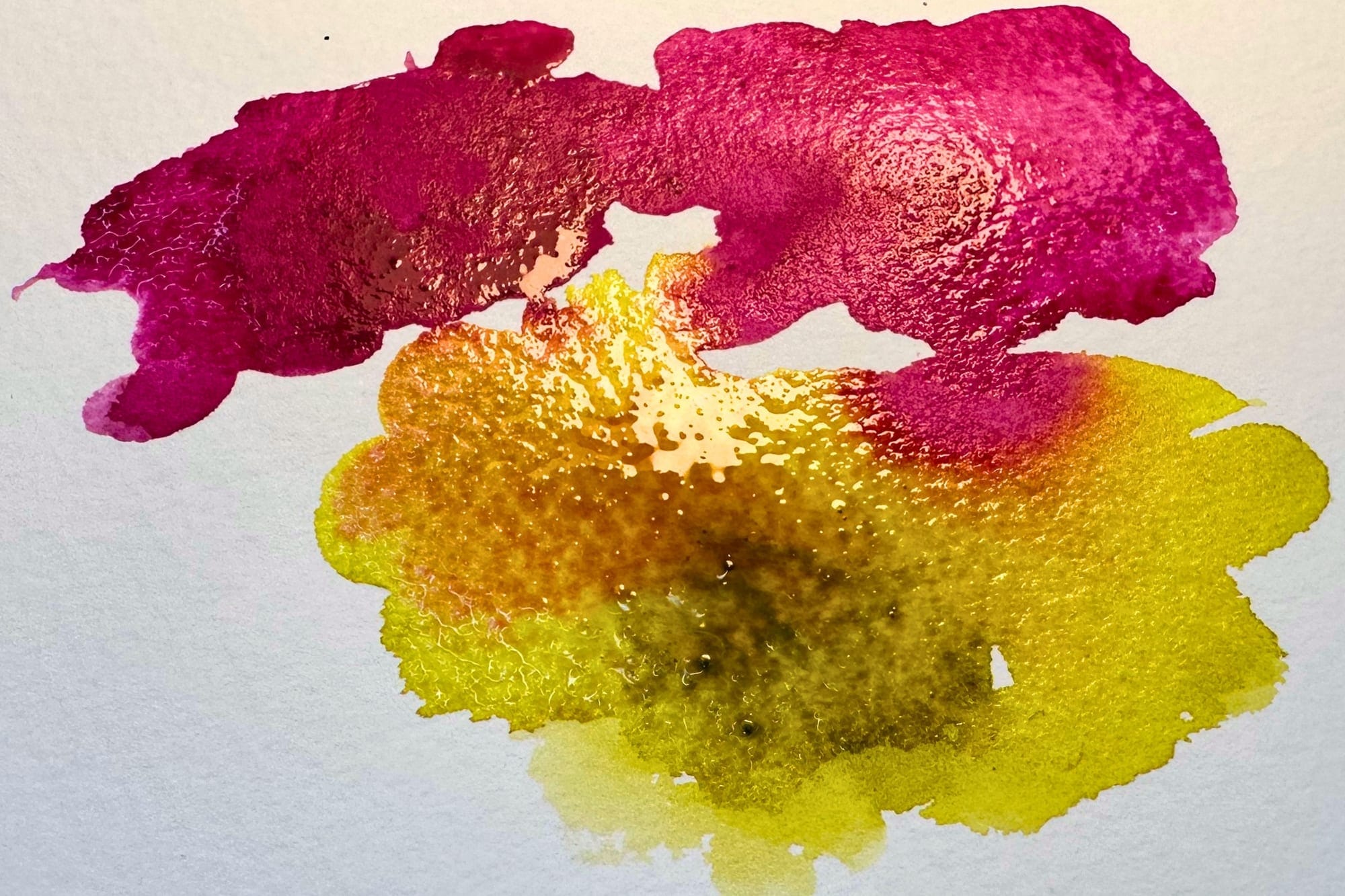
Even though I now own well over a hundred different watercolors, I keep reaching for the same tones in my botanical motifs. That may sound contradictory at first. For me, the large selection does not mean using as many colors as possible at once. Rather, it gives me the freedom to pick exactly the pigments that best capture each blossom's colors.
For greens, I have now almost entirely given up mixing my own. That has less to do with the result than with my painting process. While I paint, I want to concern myself as little as possible with technical decisions. My attention is on the blossoms – their colors, their soft transitions and their luminosity. That is where the atmosphere of a botanical watercolor comes from.
Leaves and stems are the calm counterpart for me. They should support the blossom, not compete with it. That is why I almost always work here with ready-mixed greens like Sap Green or Cascade Green. If I want the green a little cooler, I simply add a touch of PG26. This keeps my painting flow going and lets me focus entirely on the actual motif. What matters to me, though, is not the name on the tube. I used to note the maker, color number and color name on my swatch cards. Today, my large color overview, which lies right in my paint box, shows only one thing: the pigments it contains.
That is all I need. As soon as I read PB29 or PV19, for example, I roughly know how that color will behave. If it is made from a single pigment, I can judge very well how cleanly it will mix. If it is made from several pigments, I know it may separate more on damp paper, granulate, or produce muted tones faster when mixed.
To me, pigments are the real language of watercolors. Makers, color names or article numbers play only a minor role while I paint.
My conclusion
Mixing colors, for me, no longer means creating as many new shades as possible. It means getting to know your own pigments so well that you can use their qualities intuitively. Anyone who understands how warm and cool primaries work, why complementary colors neutralize each other, and how pigments react on damp paper will no longer mix colors by chance.
That is exactly why I no longer work with color names, but with pigments. They tell me more about a color than any product name. And even though I now own a huge palette, I keep reaching for the same carefully chosen tones. Not out of habit, but because I know how they behave and how they harmonize with one another.
This knowledge gives me freedom while painting. I no longer have to think about every single color mix; I can focus entirely on what actually matters to me: capturing the colors, the lightness and the special glow of a flower.
Pigment databases I use
If you'd like to dive deeper into the world of pigments, I warmly recommend these three sites – I turn to them regularly myself: