Choosing the Right Watercolor Paints – Why I Don't Recommend Standard Sets
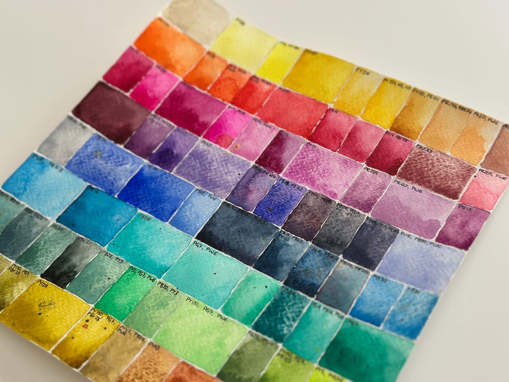
When you start out with watercolor, you often buy a classic paint set with 12 or 24 colors first. That's what's recommended everywhere. I went down that road too. Today, I wouldn't choose it again.
Not because these sets are bad. On the contrary – they're excellent for getting to know the color wheel and for practicing how to mix colors. For my botanical motifs, though, they held me back more than they inspired me. The typical primaries often feel interchangeable to me. I was missing the vivid pinks, magentas and violets that give flowers their special glow. I constantly felt I had to compromise instead of using the colors I actually saw in front of me. That's why today I put my paint set together myself.
Know your pigments
There's one phrase that has stayed with me ever since: Know your pigments. At first I thought it was an exaggeration. Today I think it's one of the most important foundations of watercolor painting. The name of a color tells you surprisingly little about how it actually behaves. What matters are the pigments it's made of. That's why, when buying, I now look at the pigment code first and only then at the color's name.
For my botanical motifs I prefer to work with colors made from a single pigment, or from as few as possible. The reason is simple. I usually paint with a lot of water and often on damp paper. As I do, the pigments move across the surface. They spread, meet other colors and keep remixing. If a color is already made from several pigments, these can travel at different speeds. Some pigments move further than others, separate from one another and create mixes I never intended.
With single-pigment colors, these processes stay far more controllable. That doesn't mean multi-pigment colors are worse in general. Many beautiful granulating colors thrive on exactly this effect. But for my luminous flower motifs, I prefer mixes that are as clear and predictable as possible.
Why colors sometimes suddenly turn gray
If you mix colors, you should know the color wheel. When complementary colors meet – red and green, yellow and violet, or blue and orange – they neutralize each other. Grays, browns and earth tones appear. For landscapes, this can be wonderful. For floral motifs, though, it often destroys exactly what I want to express: luminosity, freshness and the atmosphere of a blossom. That's why it pays to know the pigments a color contains. Even small differences can decide whether a violet looks brilliant or dull.
My biggest aha moment
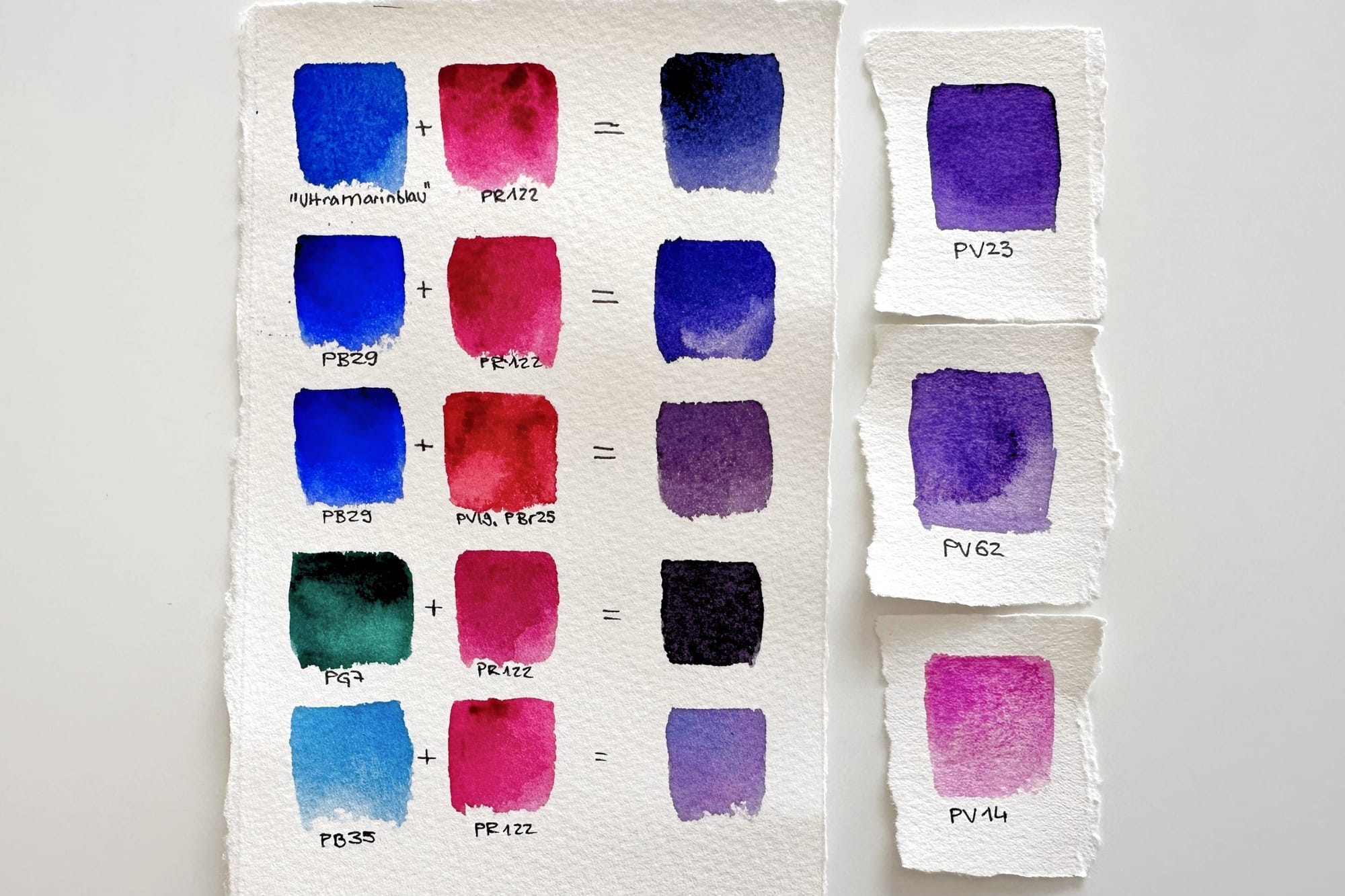
One experience changed my view of watercolors for good. When I was putting my new paint set together, I bought Ultramarine from Schmincke Horadam. I wanted to mix vivid violets with it. But no matter how I tried, the result never turned out the way I expected. I doubted my own skills. After all, I had bought high-quality artist paints. Only later did I notice the crucial difference. The color wasn't made purely from the ultramarine pigment PB29 – it also contained PB15. For my mixes, that was exactly the wrong hue. Instead of a clear, cool violet, I kept getting a warm aubergine purple. Soon after, I discovered the same maker's Ultramarine Finest, which is made from PB29 alone. Since that day, I no longer buy colors by their name, but by their pigments.
Binder, ox gall and fillers
At least as important as the pigments themselves are the other ingredients in a watercolor. The binder is usually gum arabic. Beyond that, some makers add wetting agents such as ox gall. I've personally never really made friends with it. For one thing, it's derived from cattle bile and therefore isn't an option for many people. For another, it significantly changes how the paint flows.
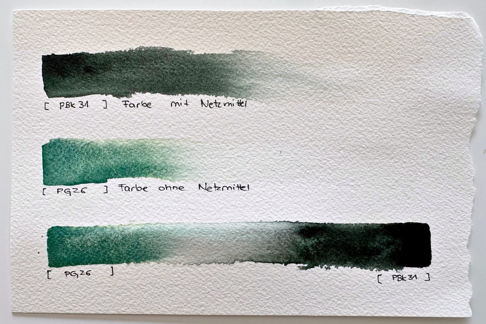
Colors with ox gall often spread much further on damp paper than others. As they go, they push aside pigments that contain no wetting agent. Especially if you – like me – enjoy painting with lots of water, this quickly becomes hard to control. That doesn't mean such colors are bad. I simply use them very deliberately and reduce the amount of water when I know a color flows especially strongly.
What has no place in high-quality watercolors, in my view, are fillers – the kind you often find in cheap opaque paints or very cheap 'watercolor sets'. They reduce a color's brilliance and are often noticeably harder to mix.
Pans or tubes?
This question comes up surprisingly often. My answer is simple: both work. And of course you may paint straight from the tube. Fresh from the tube, many colors are even particularly intense and strong. Over time I've simply gotten into the habit of decanting my favorite colors into pans. Not because it makes them any better. But because I now own more than a hundred different colors, and this way I keep track of them much faster.
Artist or student grade?
Many makers offer their colors in two quality levels. Student-grade paints are cheaper and often perfectly sufficient. Artist-grade paints, on the other hand, usually contain higher-quality and more lightfast pigments. I work almost exclusively with artist-grade paints and consistently pay attention to high lightfastness.
The only exception is my Neon Pink, or Opera. Here I deliberately use a White Nights variant that, alongside fluorescent dyes, also contains the pigment PR122. Should the neon effect fade over the years, at least the underlying pink will remain.
My personal maker recommendations
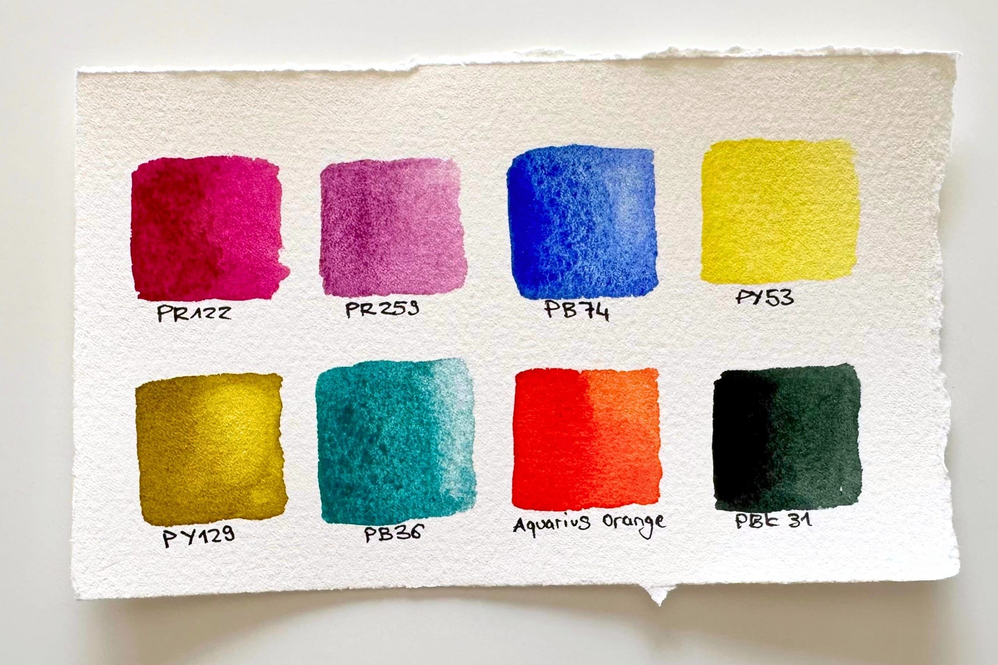
After many tests, I've let go of the idea of using all the colors from a single maker. Instead, I pick out the most beautiful pigments from different brands.
This small manufacturer from Poland makes – in my humble opinion – the most luminous watercolors I have tested so far. The value for money is excellent if you can order directly from Poland. The only small drawbacks: limited availability outside Poland and the lack of a tube range.
A huge selection of beautiful pigments at an exceptionally good price – a great choice, especially for beginners. Some pigments are ground a little more coarsely, which occasionally shows as fine specks. In most mixes you'll barely notice it. Just keep an eye on the lightfastness of individual colors.
A few colors from other makers are still among my absolute favorites. I wouldn't want to be without Old Holland's Ultramarine Pink, Winsor & Newton's Cobalt Violet Light or Daniel Smith's Cascade Green. Sennelier, Holbein and Lukas also offer good quality and lovely base tones, but hold fewer inspiring treasures for me. In the end, what matters to me isn't the name on the tube. It's the pigments inside it.
My most important tool
Good watercolor painting doesn't begin with the right paints. It begins with really getting to know your own paints.
No matter which colors or which maker you choose – start a swatch card early. No color chart from the internet can replace your own mixes. I work with my swatch cards in every single painting session and update them regularly as new colors join. That's also why I developed my own botanical swatch cards. They help me compare colors quickly and put together new palettes for my flower motifs.
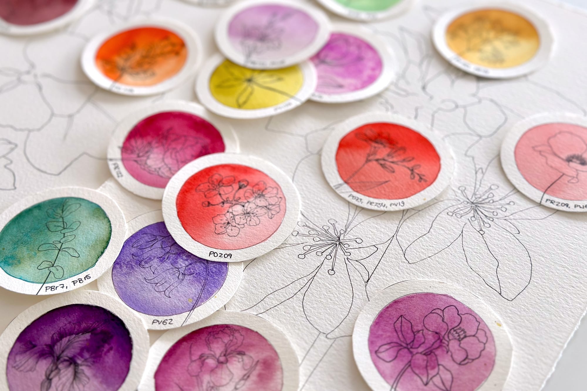
Once you know which pigments are on your palette, how they react with one another and how they behave on damp paper, you'll no longer mix colors by chance. You'll use them deliberately. And that, for me, is exactly where the real magic of watercolor begins.
Pigment databases I use
If you'd like to dive deeper into the world of pigments, I warmly recommend these three sites – I turn to them regularly myself: