The Perfect Green – My Favorite Tones for Leaves, Stems and Shadows
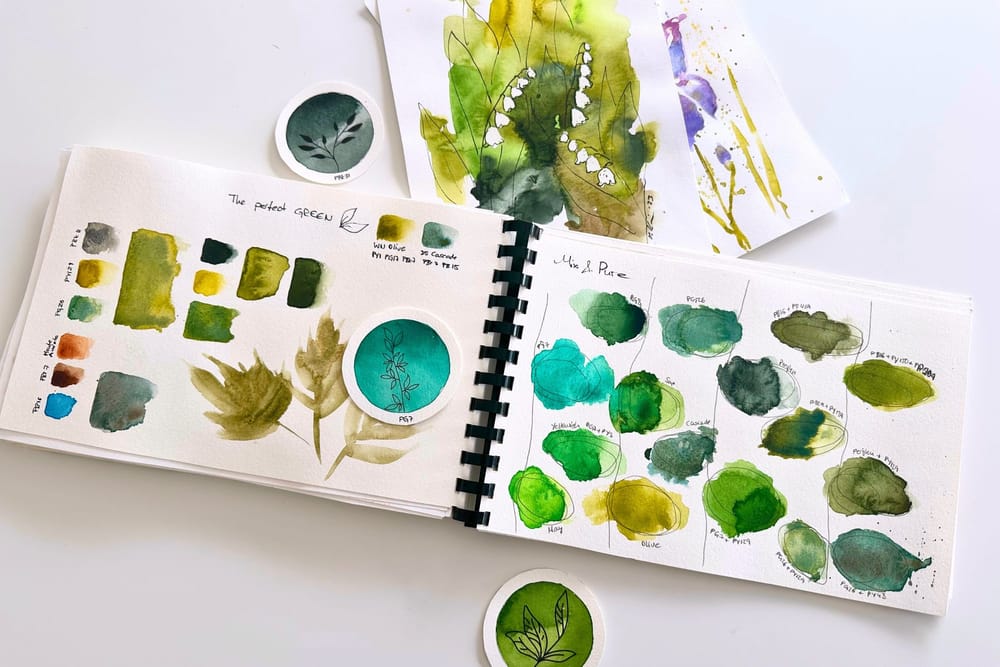
Green is, for me, the hardest color in botanical watercolor. It's everywhere, in every leaf, every stem, every shadow, and yet green straight from the tube often looks artificial and loud. A wrong green can tip an entire painting and steal the show from the bloom. That's why I'm more particular about my greens than about almost any other color. Here are the ones that truly work for me.
The color I don't actually like
Let's start with my problem child: phthalo green, PG7. Honestly, I can't stand this tone on its own. It's far too garish and unnatural for me; in a flower painting it would overwhelm everything.
And yet it doesn't go missing from my palette. Because PG7 is wonderful the moment you mix it with a deep pink or violet. Combined with PR122 or PV19, it makes a deep, mysterious purple that I love to use for the shadows in blooms. A good example of the fact that there are no bad colors, only the wrong use of them.
My favorite greens for leaves
For the actual leaf green, I reach most readily for Sap Green, regardless of the brand. The compositions differ a lot, but they all have one thing in common: with little water, Sap Green is very dark and deep; with plenty of water, it opens up into a cheerful, fresh tone. So a single pan can handle both the light areas and the deep shadows in the foliage.
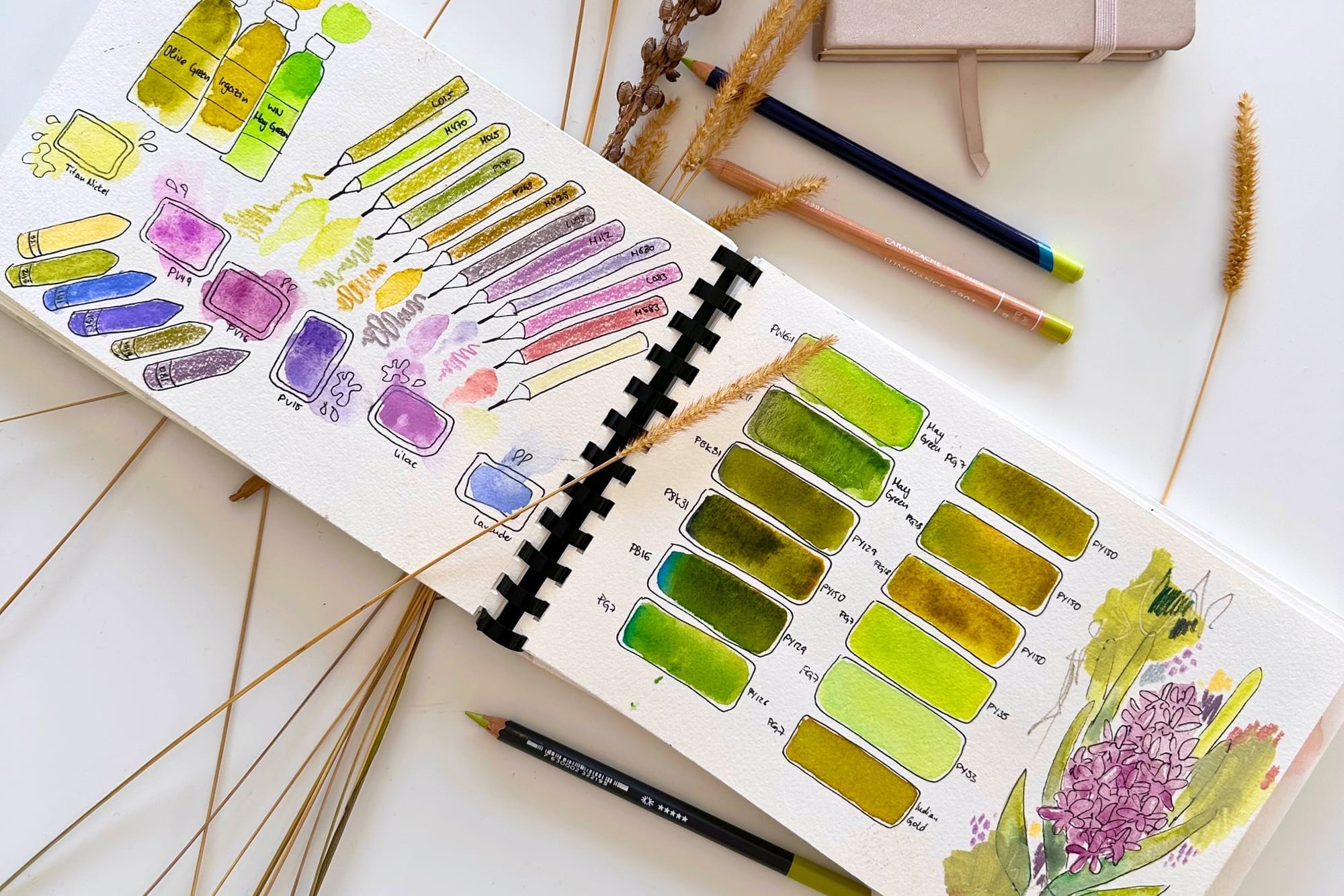
Also indispensable for me is PBk31, Perylene Green. It's actually a black, but to the human eye it reads as a deep green. I love it for the shadows in green. It has one small catch, because it fades a little after drying. And in color theory at university it would be frowned upon, since for shadows I should really work with the complementary color. I love this color anyway, and sometimes you simply have to paint what feels right.
How I build up a natural leaf green
Perhaps it helps to see how I go about it in practice, because a natural leaf is rarely just a single green. I usually start with Sap Green, with plenty of water for the bright, sunny spots and with little water for the rich mid-tone. While the paper is still damp, I drop a little PBk31 into the shadows, or my deep purple from PG7 and PR122. That gives depth without making the green dull. And where young, fresh green should glow, I dab in a warm yellow-green like my beloved green gold. Layer by layer, a green emerges that looks alive rather than flat.
My most important tip along the way: never apply a ready-made green pure and flat. Better to vary it with water, break it with a second tone and let the edges run into one another. That is exactly the difference between a green that looks like plastic and one that looks like a real leaf.
Cool greens for stems and winter
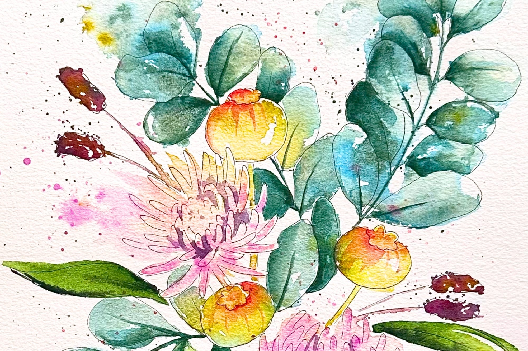
When things should turn cooler and quieter, PG26 is my favorite. It's a wonderfully cool, granulating tone, perfect for eucalyptus and for the cool stems of some plants. To me it's the green of winter, because it isn't as juicy and lively as a summer green.
A real beauty is also Cascade Green by Daniel Smith, a ready-made granulating mix of the blue PB15 and the brown PBr7. This color looks mysterious and can be steered beautifully with a little knowledge of granulating pigments. My trick: after applying it with plenty of water, I wait a moment until the two pigments have separated slightly. Then, with a dabbed brush that is neither wet nor dry, I carefully lift the blue pigment back off. That way the warm brown comes through more strongly, and a depth all its own appears.
The quiet greens that never steal the show
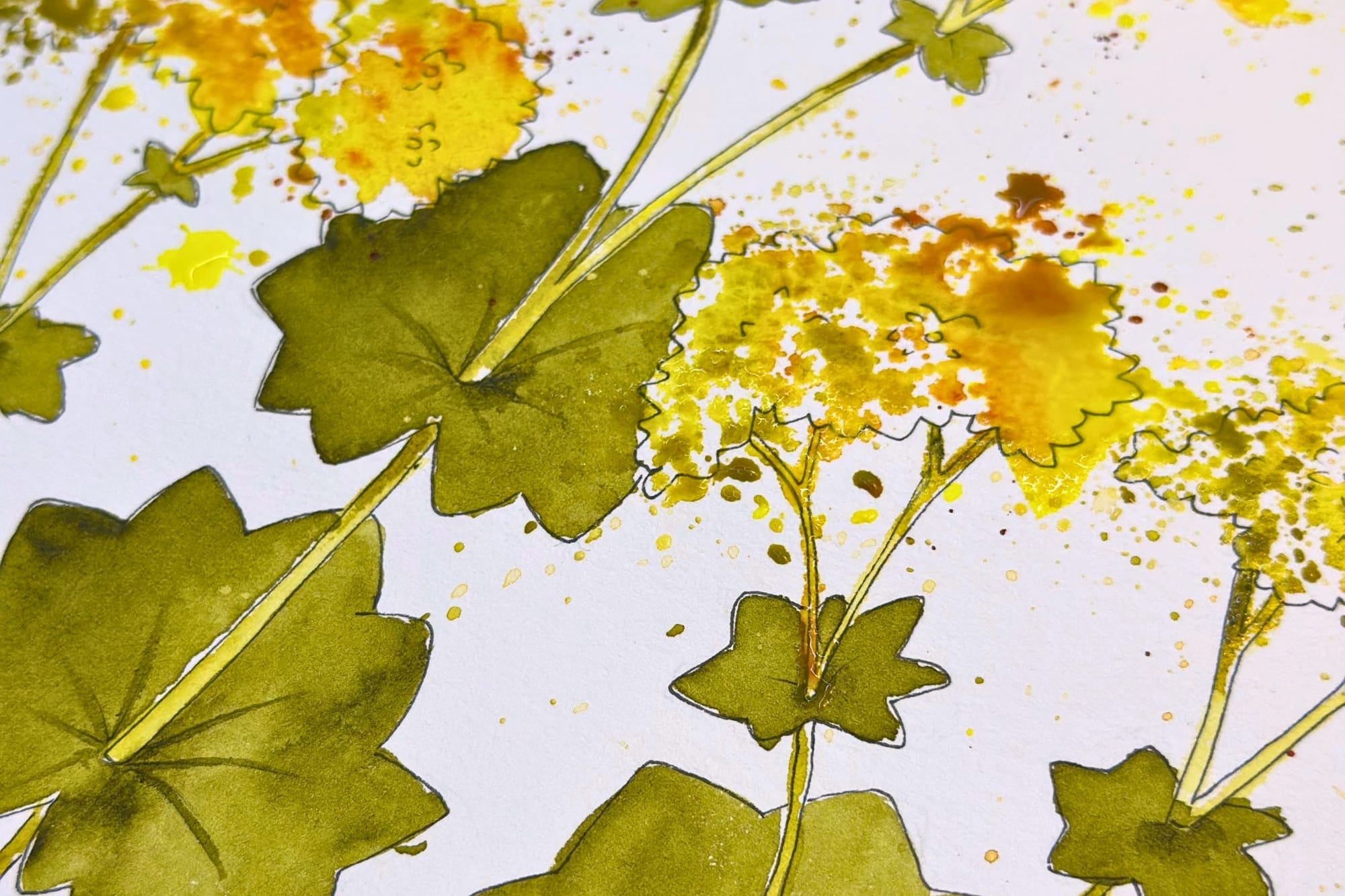
In general, I love muted green tones like olive green or green earth. They are restrained and never push to the front, and with flowers that is worth its weight in gold. They carry the motif without taking the attention away from the bloom.
A small note from experience: I was very fond of the Olive Green from White Nights, but it is sadly not lightfast. So here I switched to other brands. With green in particular it's worth a look at lightfastness, so the leaves don't suddenly look different after a few years than they did on the first day.
And the ones that are too loud for me
Not every beautiful green finds its way into my flowers. May green and chartreuse green, for example, are two lovely tones, but for my floral motifs they are simply too loud. I keep both in my box, in case I want to paint something abstract with them one day. And this from me of all people, who otherwise paints such bold pictures.
In the end, the perfect green for me is not a single color, but a small selection that plays together. A deep one for the shadows, a fresh one for the light, a cool one for calm, and a quiet one that lets the bloom glow. Which pigments actually live in my box can be seen on my Pigments page.
And because color is so personal, one last smile to end on: while I avoid PG7 to this day, my son of all people loves this very green. In kindergarten he painted with almost nothing else, another little greeting from neurodivergence. Maybe there is no single perfect green after all. There is only the one that suits you.