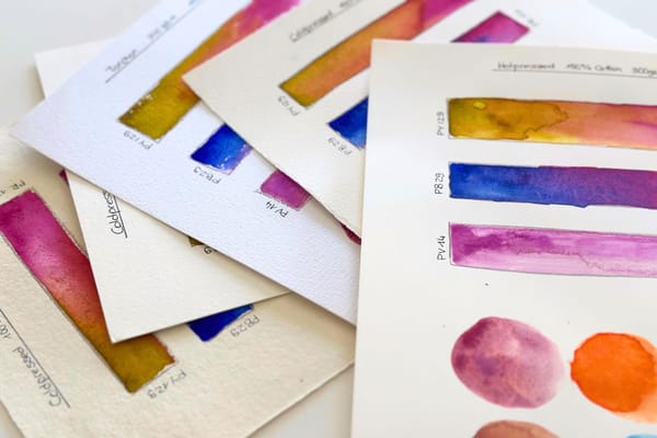
Why the Same Color Looks Different on Every Paper – Texture, Material and Shade of White Compared
Hot pressed, torchon, cotton or cellulose, bright white or natural white. Why the surface decides a tone just as much as the color itself.
Thoughts, techniques and insights from my studio.
Hot pressed, torchon, cotton or cellulose, bright white or natural white. Why the surface decides a tone just as much as the color itself.
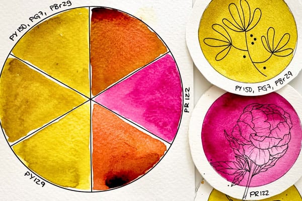
Green Gold comes as a single pigment and as a ready-made blend. On paper they look almost the same, but on the color wheel a subtle difference shows.
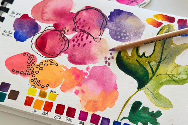
Why a sheet of paper and a few colors bring me more calm than yoga or meditation.
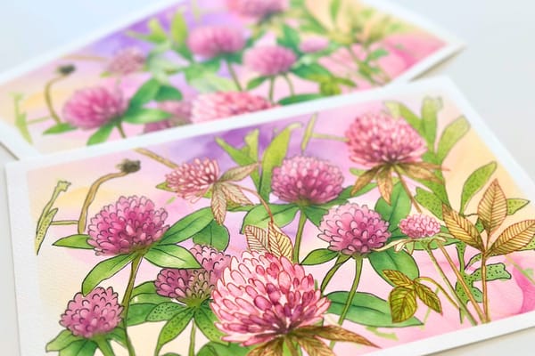
No lines to stay inside, and no blank page. Why reverse coloring calms so many people right now and how the red clover sheet works for it.
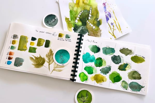
Why green is the hardest color in botanical watercolor, and which green tones actually work for me without stealing the show from the flowers.
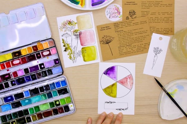
A small palette of pure colors and mixtures. And how the play of green and violet gives the airy wild carrot its depth and shadows.
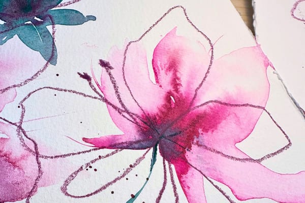
In an age where a machine produces an image in seconds: why I still paint by hand, and why so many people are picking up the brush again right now.
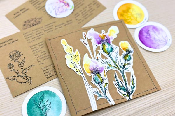
How the thistle motif from the August package turns into a layered folding card, step by step, and why this particular thistle is so special to me.
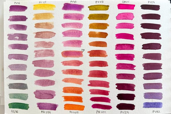
Why I don't just see colors but feel them, experience them in phases of life, and tell them apart more finely than most. A look through my eyes.
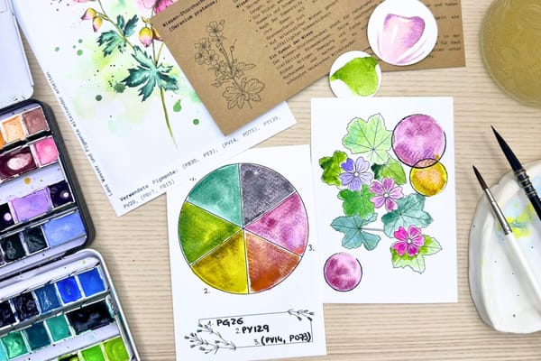
Why a swatch card and a small color wheel made from just three pigments are the best way to truly get to know your colors.
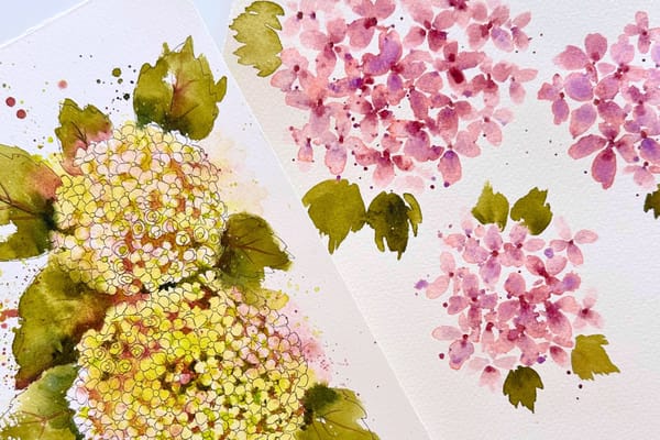
About my style, an art professor who didn't like my fineliner, and what autism and ADHD have to do with the fact that the norm was never my goal.
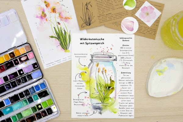
Why the unassuming ribwort plantain is more than a motif: its traditional uses, and a recipe for homemade candies to color in and to make.
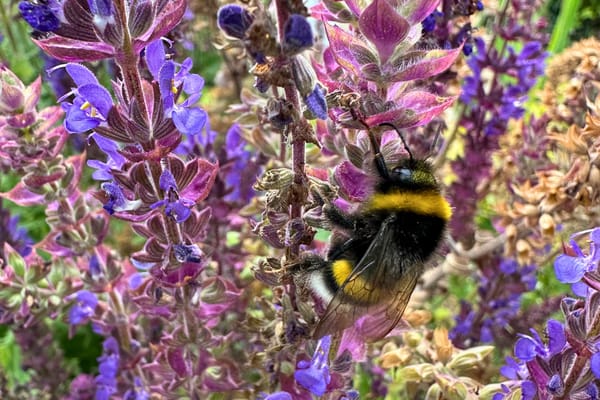
Why I now paint the wild, often unloved flowers of the meadow, about conservation, the quiet strength of the overlooked, and the path from my own photo to a hand-drawn, waterproof template.
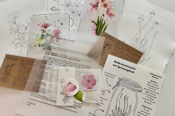
Why I completely rethought my Atelier Plus package, and how the August package makes getting started with painting as easy as possible.
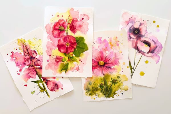
Why I have loved flowers since childhood - from my grandmother's hollyhock to the calm that painting brings me. A very personal look behind my motifs.
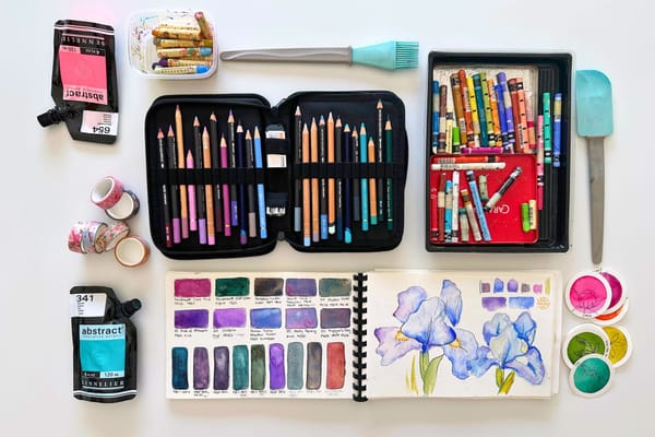
Fineliners, watercolor pencils, stamps, washi tape and more - little helpers that make painting more playful. Plus one I deliberately do without.
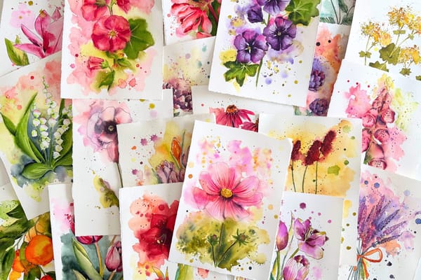
I analyzed my last 22 watercolors and looked at which colors I really use. What emerged is something like my personal palette – surprisingly small, almost entirely single-pigment, and with hardly any mixing.
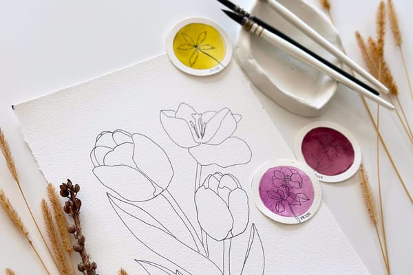
Why templates aren't cheating, how to transfer them onto watercolor paper – and why the outline, for me, is a starting point rather than a limit.
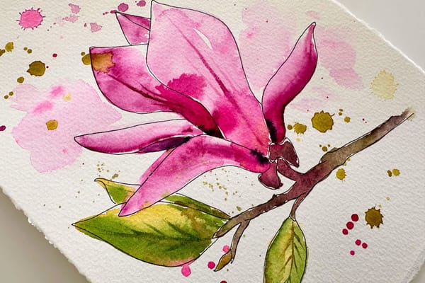
Wet-in-wet, glazing, gradients, negative painting and more – the essential watercolor techniques as tools for botanical motifs.
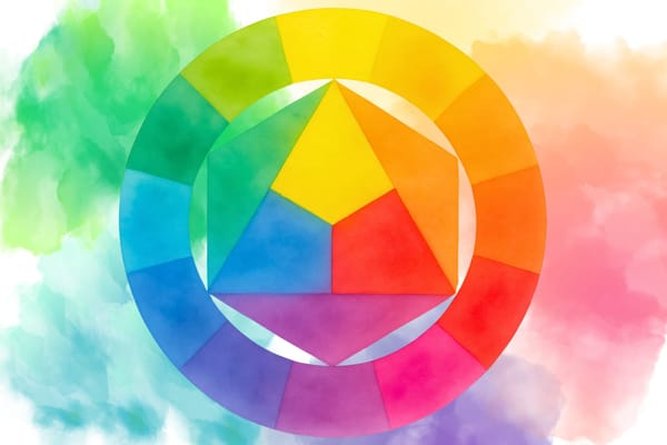
Warm and cool primaries, complementary colors and pigments on damp paper – how I mix colors deliberately instead of by chance.
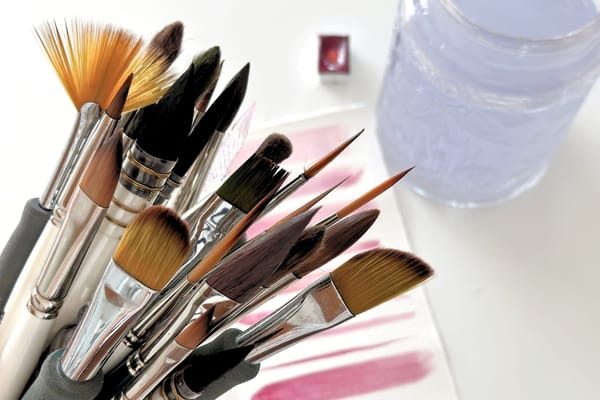
Why more expensive doesn't automatically paint better – and what really matters with watercolor brushes: water capacity, shape and care.
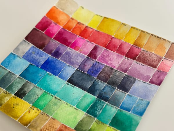
Why I don't recommend standard paint sets – and how I learned to choose watercolors by their pigments instead of their names.
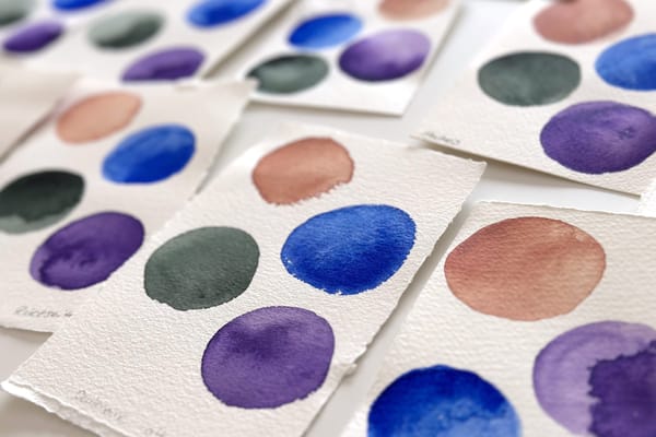
Why 300 gsm and 100% cotton don't automatically make the best paper – and the two papers I actually work with today.