My Perfect Color Palette – The Colors I Reach For Again and Again
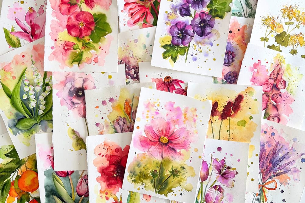
In my article on the right watercolor paints, I claimed that big standard paint boxes tend to slow me down, and that for luminous flowers there is hardly a way around single-pigment colors. This time I wanted to know whether that is really true – or whether I am just imagining it.
So I looked back. I took my last 22 paintings and, for each one, noted which colors I had actually used. What came to light is something like my very own palette – and it looks different from what I expected.
The same colors again and again
Even though I now own well over a hundred watercolors, a single picture almost always comes together from just eight or nine tones. And across all the pictures, the same colors show up surprisingly often.
A single color appears in 18 of my 22 pictures – in almost every one. Seven more I use in over half of all the pictures. So there is a small group of favorite colors I keep reaching for, quite automatically. This handful alone could paint most of my watercolors.
That, for me, is the heart of the matter. A big box promises variety – but in the end, painting happens with just a few familiar colors.
I actually hardly ever mix
This analysis revealed something else, too: I hardly mix at all while painting. Strictly speaking, there is only one single tone I regularly mix myself – a dark purple from phthalo green (PG7) and quinacridone magenta (PR122). Everything else goes straight onto the paper as pure pigment or as a ready-made color.
Honestly, I am not a big fan of mixing. I would rather let the pigments and finished colors work on me. As an autistic person with ADHD and a form of synesthesia – I actually smell flowers from photos or from well-painted pictures – clear, pure colors simply make more sense to me than a complex blend. Maybe that is the real reason my palette looks the way it does.
Why almost everything is single-pigment
More than half of the colors I use are made from a single pigment. And the more often I use a color, the more likely it is to be a single-pigment one: among my ten most-used tones, nine are pure single pigments.
That is no coincidence. Single-pigment colors behave more predictably on damp paper, stay cleaner, and glow more reliably in floral motifs. Since I barely mix anyway, they play to their greatest strength: pure, clear color, without anything turning muddy.
The biggest surprise: hardly any blue
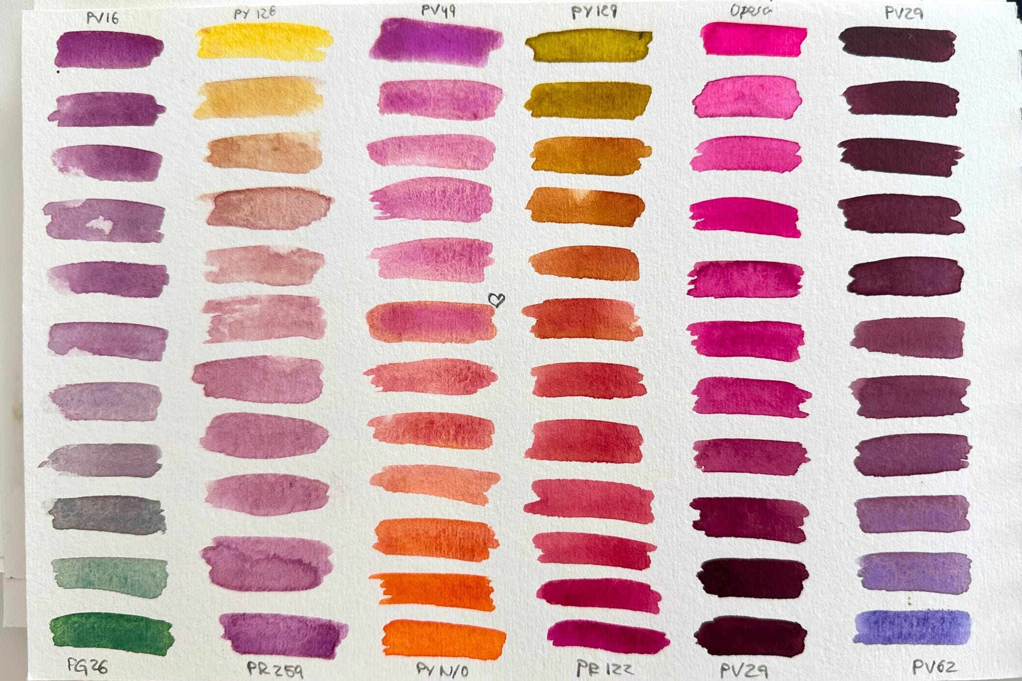
One result did astonish me, though. I used pure blue in all these pictures only a single time. For someone who paints as much as I do, that sounds almost impossible.
But on reflection it makes sense. My subjects are blossoms, and blossoms are rarely simply blue. They live on pink, magenta and warm yellows. And since I hardly mix, I do not reach for blue to turn it into something else, either. So it stays almost entirely in the box – ready for the day when something abstract does tempt me.
My palette
Enough numbers – here are the colors themselves.
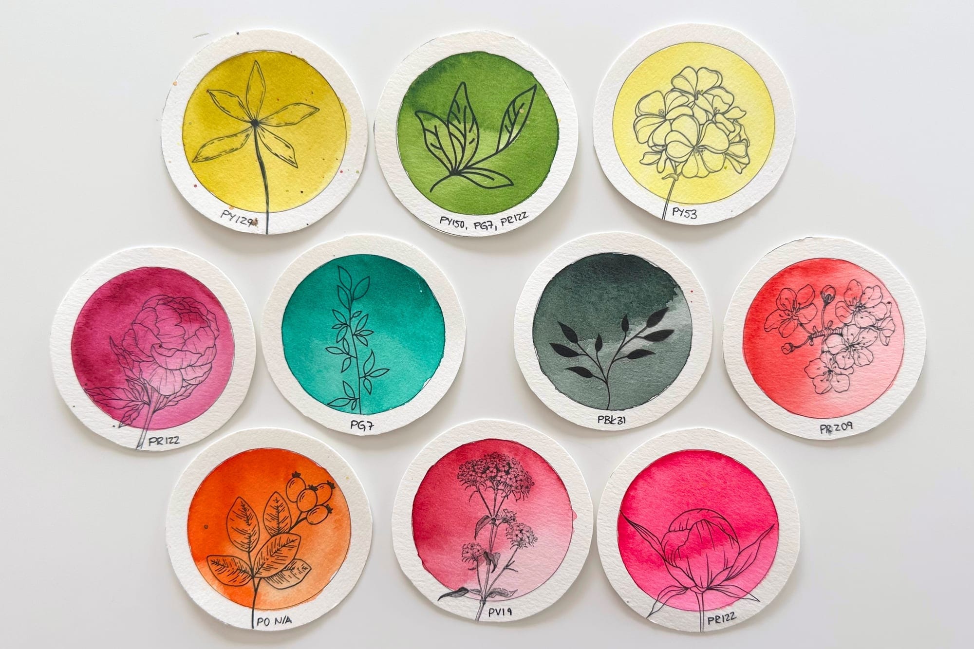
These are my ten most-used tones from the last 22 pictures, with their pigments and how often they appear:
- Green Gold – PY129 · in 18 of 22 pictures
- Sap Green – PY150, PG7, PR122 · in 14 pictures
- Nickel Titanate Yellow – PY53 · in 14 pictures
- Quinacridone Magenta – PR122 · in 14 pictures
- Phthalo Green – PG7 · in 13 pictures
- Perylene Green – PBk31 · in 11 pictures
- Quinacridone Coral – PR209 · in 10 pictures
- Aquarius Orange – Roman Szmal, single pigment · in 6 pictures
- Quinacridone Pink – PV19 · in 6 pictures
- Neon Pink – PR122 (with a fluorescent additive) · in 6 pictures
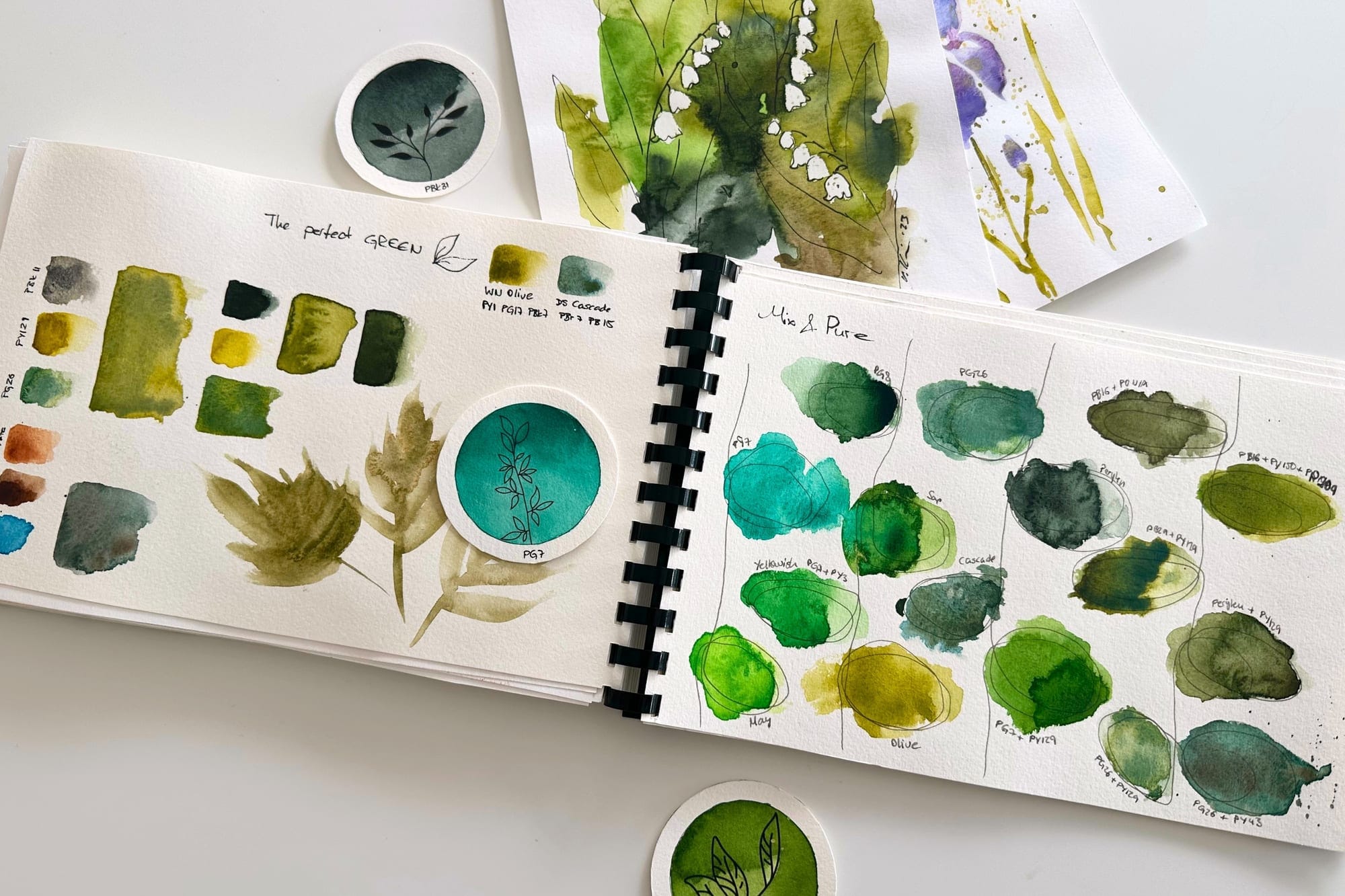
What stands out is the mix of warm yellows and green-golds, luminous pinks and magentas – and, in between, the greens for leaves and stems. The only truly multi-pigment color in this selection is Sap Green, my ready-bought green. Green is thus the deliberate exception to my single-pigment rule. I have indeed given thought to how to mix a perfect green yourself – yet leaves and stems are, for me, mostly the scaffolding of the blossom: calm and rather in the background. A ready-made green keeps my painting flow going and saves me from mixing mud, while the pure, luminous pigments stay reserved for the blossom.
My conclusion
This little review showed me in black and white what I had only felt before. I do not need a big paint box. I need my colors – and they are mostly made from a single pigment.
A standard set of 24 tones would probably give me twenty colors I barely touch, and leave out exactly the luminous pinks and green-golds that make my pictures what they are. For me, the opposite path makes much more sense: a small, deliberately assembled palette of colors whose pigments I know and whose behavior I can predict.
And yet – a small confession: my paint box holds exactly 80 selected colors. You can see it regularly in my Instagram reels and in the guided painting sessions. In the cupboard there are quite a few more, especially many browns, so I come to over a hundred in total. You can look at them all on my My Pigments page. Why so many, when I keep reaching for the same ones? Because you never know when the urge for something new or abstract will strike. Then even the many blues finally get their moment, the ones that otherwise barely play a role in my blossoms.
In the end, it is not about owning as many colors as possible – but about really knowing your few.
This is exactly the palette I read out of my last 22 pictures. And honestly: it feels just right.
Pigment databases I use
If you'd like to dive deeper into the world of pigments, I warmly recommend these three sites – I turn to them regularly myself: