The Swatch Card and the Color Wheel – Building a Whole World of Color from Three Pigments
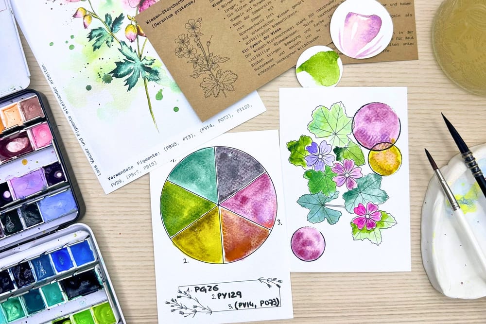
My package doesn't only hold motifs to color in, but also two small tools with which you really get to know your colors: a swatch card and a color wheel. Both look unassuming, but they've taught me more about color than any book.
Why I love swatch cards
A swatch card is basically a profile of every single color. Only once I've seen a tone applied, diluted and dried do I really know how it behaves. How pale it draws out, whether it granulates, whether it lightens after drying, how warm or cool it looks next to others.
That's exactly why my own swatch cards are my most important point of reference, more important than any name on a tube. The card in the package carries the motif of the month itself, this time the meadow cranesbill, and invites you to try the colors out on it right away. A few minutes of swatching at the start save many surprises later.
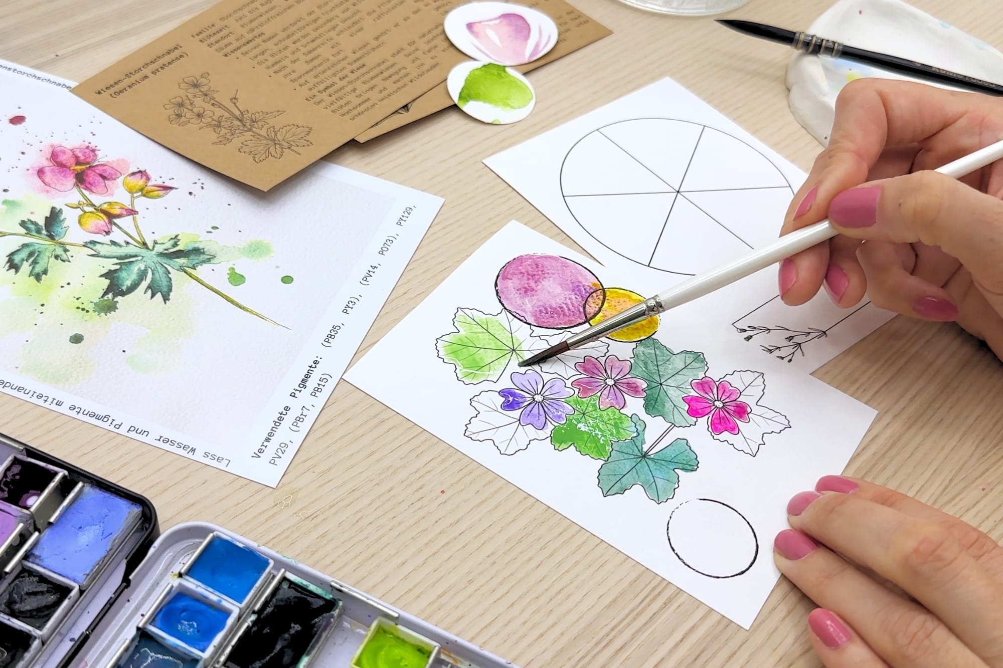
A color wheel from just three pigments
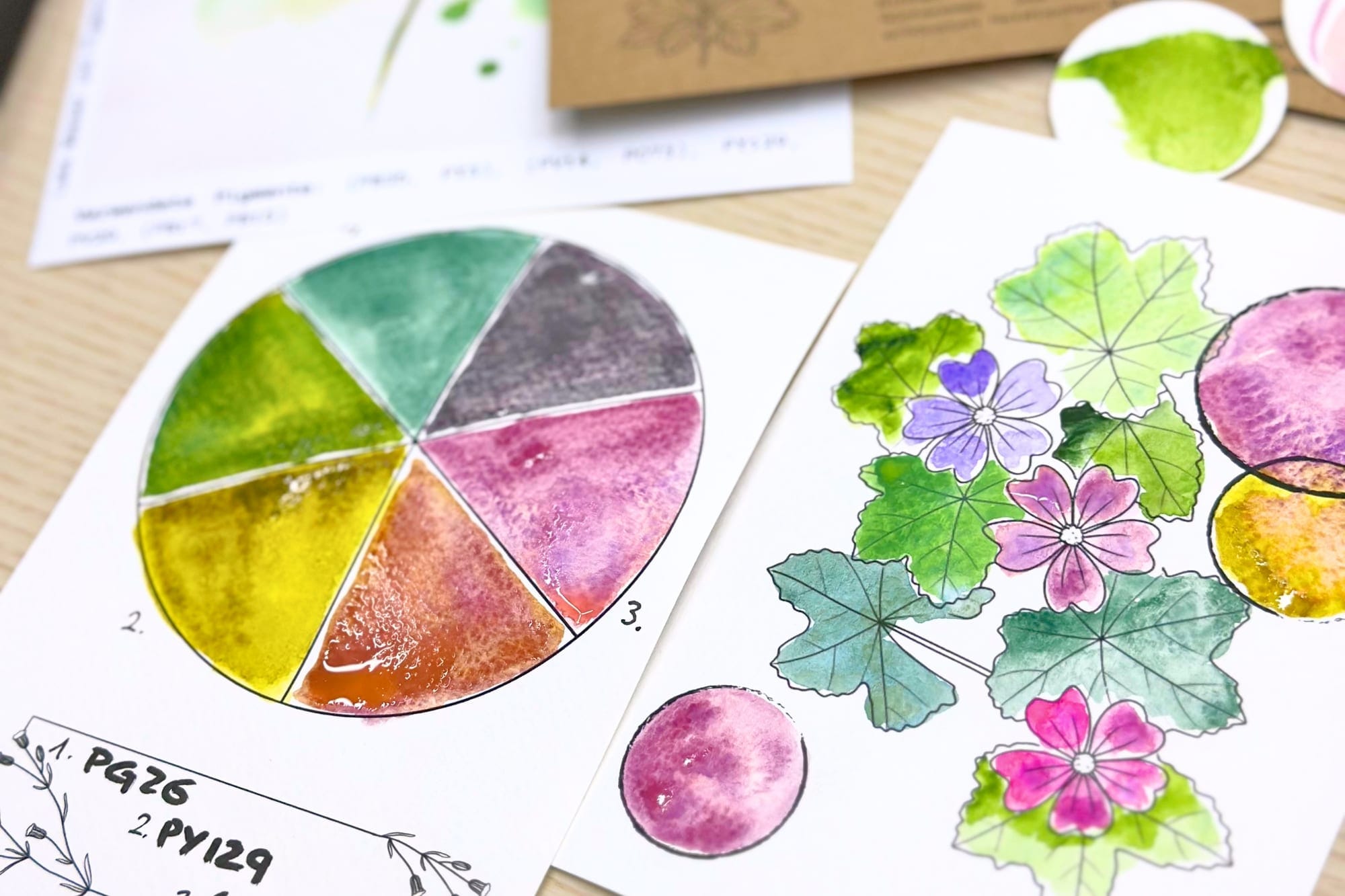
I love the little color wheel even more, because it shows something astonishing: from just a few pigments a whole world of color arises. For this motif I chose three that are at the same time the colors of the plant. A cool, granulating green, PG26. A warm yellow-green, my beloved green gold, PY129. And a soft pink that I mix from PO73 and PV14.
These three sit at the corners of the wheel. Everything in between arises solely from their mixtures. And suddenly you no longer need thirty pans to paint a whole leaf full of life.
What the mixtures reveal
The lovely thing about mixing along the wheel is that it trains your own eye. The green gold and the green together give the fresh and the deep leaf tones. The pink and the green, which sit opposite each other on the wheel, dampen one another into quiet, natural greys, exactly the ones that give a picture depth without making it dirty. And the pink with the yellow-green gives the warm transitions in the buds and stems. The flowers of the meadow cranesbill themselves range from a soft pink to a cool violet, and this whole span can be drawn from that one pink by tuning it a little warmer or cooler.
Whoever has once painted such a wheel themselves understands their colors differently afterward. You no longer see just green and pink, but sense how they belong together.
Why this belongs, for me
For me, this is the very heart of my work: that painting becomes an understanding and not a guessing. A small, coherent selection of colors takes away the fear of mixing and creates harmony almost by itself, because all the tones come from the same family. That's why every package holds, alongside the motifs, this little piece of craft. Which colors live in my box for good, I've shown in My Perfect Color Palette.