Why the Same Color Looks Different on Every Paper – Texture, Material and Shade of White Compared
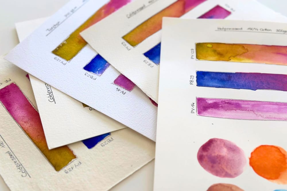
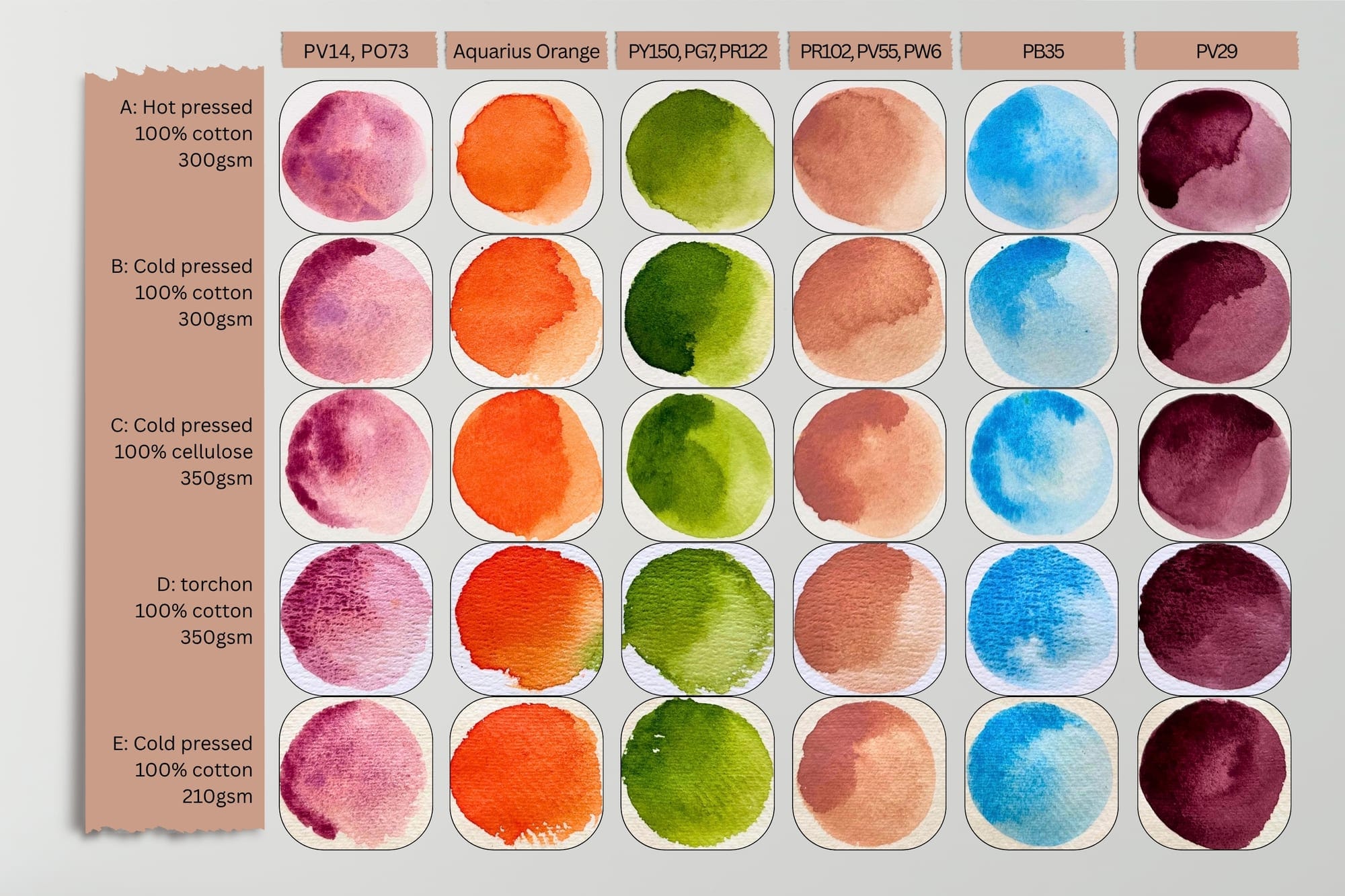
When I think about watercolor, most people go to the colors first. Yet the paper decides at least as much about how a painting looks in the end. The same tone can appear luminous and soft on one sheet and dull and blotchy on another. That is why I want to take a closer look at what the paper does to my colors. Which papers I generally recommend after many tests I have already gathered elsewhere. Today I am interested in something else, namely how one and the same color changes its character from sheet to sheet. In this article I swatch the same tones on seven very different papers so that the differences really become visible. Hot pressed, cold pressed in the fine version, torchon, a paper made of cotton and one made of cellulose, plus bright white and natural white.
The Texture Is the First Thing You Feel
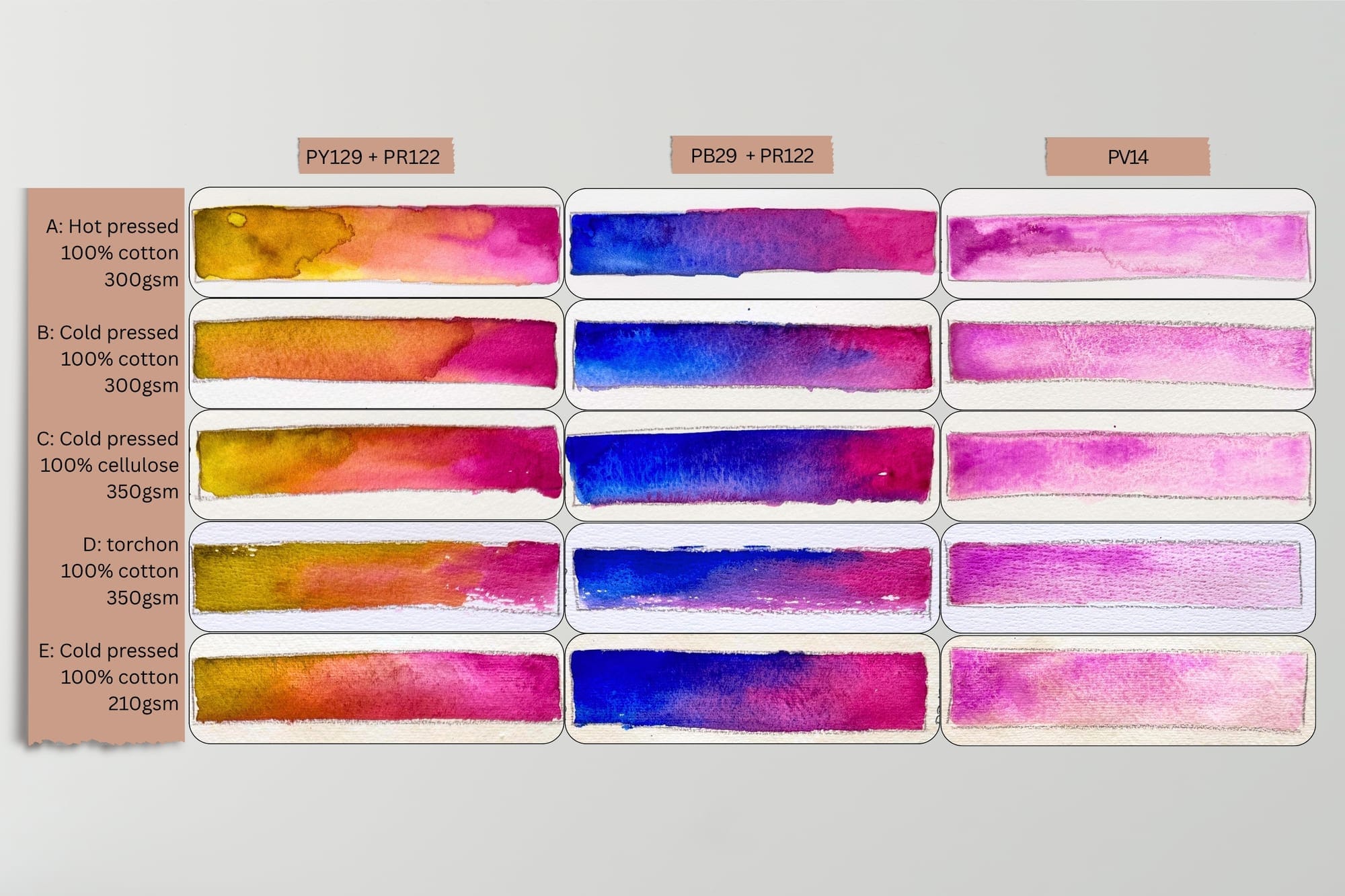
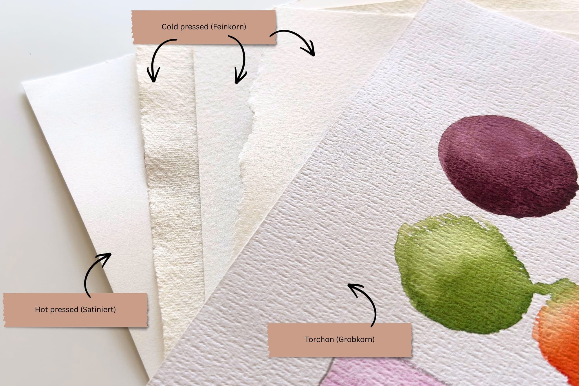
The first thing a paper reveals is its surface. It ranges from perfectly smooth to rough, and this very texture determines how the color spreads, how quickly it dries, and how a motif looks in the end. The easiest way to understand the difference is to simply lay the same tone down side by side. For my flowers I have developed a clear preference over time, namely the fine surface in the middle. Why that is becomes clearer when I go through the three levels one by one.
Hot pressed: smooth, but not my paper
Hot pressed paper is smoothed between heated rollers and has almost no texture. In my experience the colors are noticeably less radiant on it. And when I paint with a lot of water, as I like to do, blotches form quickly, because the paper soaks up the color strongly and gives it hardly any time to flow. For very fine, detailed work hot pressed may be the right paper. For my own style with plenty of water and soft, flowing transitions it is not.
Cold pressed fine: my perfect middle ground
Cold pressed in the fine version is my favorite paper. It has a light, even grain and is exactly the right middle ground for me. Granulating colors come into their own here especially well. A grainy, cool green, like the one I described in the perfect green, settles finely into the tiny valleys, so that the surface becomes lively without becoming loud. At the same time I have enough time to let the color flow and to paint soft transitions, just the way I like. If I had to choose a single paper, it would be this one.
Torchon: when the texture paints along
Torchon is heavily textured, with deep valleys and pronounced peaks. Here the surface clearly paints along. The dry brush skips over the peaks and leaves a lively shimmer, and even a simple wash takes on a distinct grain. For my flowers, however, this is too rough. The soft, delicate shapes of a blossom lose too much of their calm on this texture, which is why torchon remains more of an exception for me.
Cotton or Cellulose
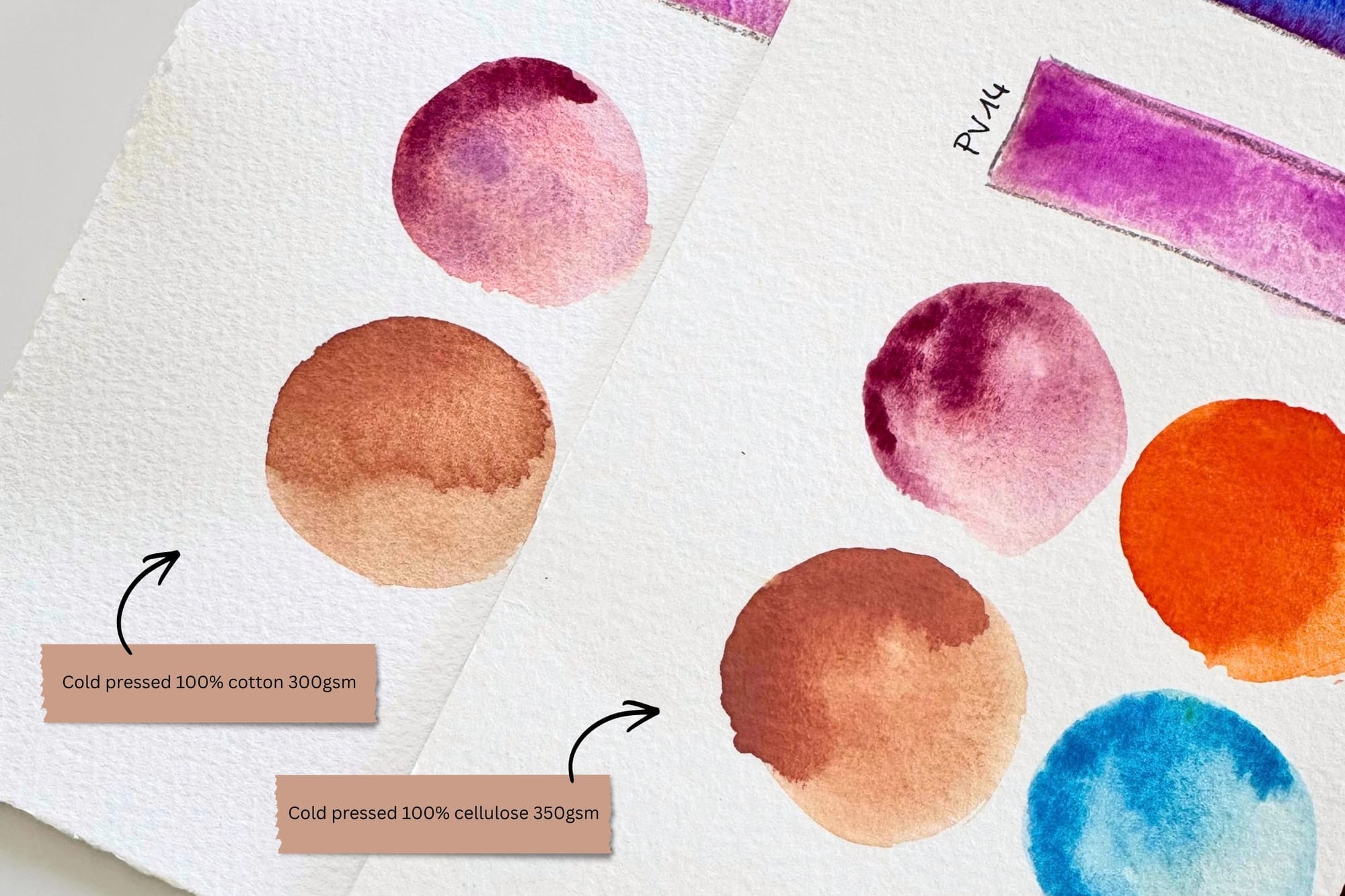
Besides the surface, the material matters. Cotton consists of long fibers, withstands a lot of water without buckling much, and distributes the color evenly. I can work calmly in several layers, lift color again and wash edges out softly. Cotton forgives a great deal and is accordingly high in quality, but also more expensive. For my painting sessions I therefore reach for cotton. Cellulose consists of wood fibers, takes up the color faster and somewhat more unevenly, and dries quickly. Soft edges are harder to achieve on it. On the other hand, cellulose is very well suited to more abstract work where the motif needs no soft transitions, or when I combine different materials. For everything outside the painting sessions I therefore use cellulose.
The Sizing
How strongly a paper takes up the color at all also depends on the sizing. By this we mean a kind of protective layer with which the fibers are treated so that the paper does not soak up the color immediately like blotting paper. It exists inside, in the pulp, and additionally outside, on the surface. If a paper is well sized, the color stays on top longer. I then have time to let tones flow into one another, to lift color again and to paint soft transitions. If the sizing is missing, on the other hand, the color sinks in at once, looks duller and can hardly be moved anymore.
How sensitive this interplay is I experienced myself when a manufacturer switched to a vegan sizing. The weight and the cotton content stayed the same, and yet the paper suddenly behaved differently. What sizing is all about in detail I have already described in choosing the right watercolor paper. For this comparison what matters above all is that even small differences in the sizing make the same tone flow quite differently on two similar papers.
Bright White or Natural White
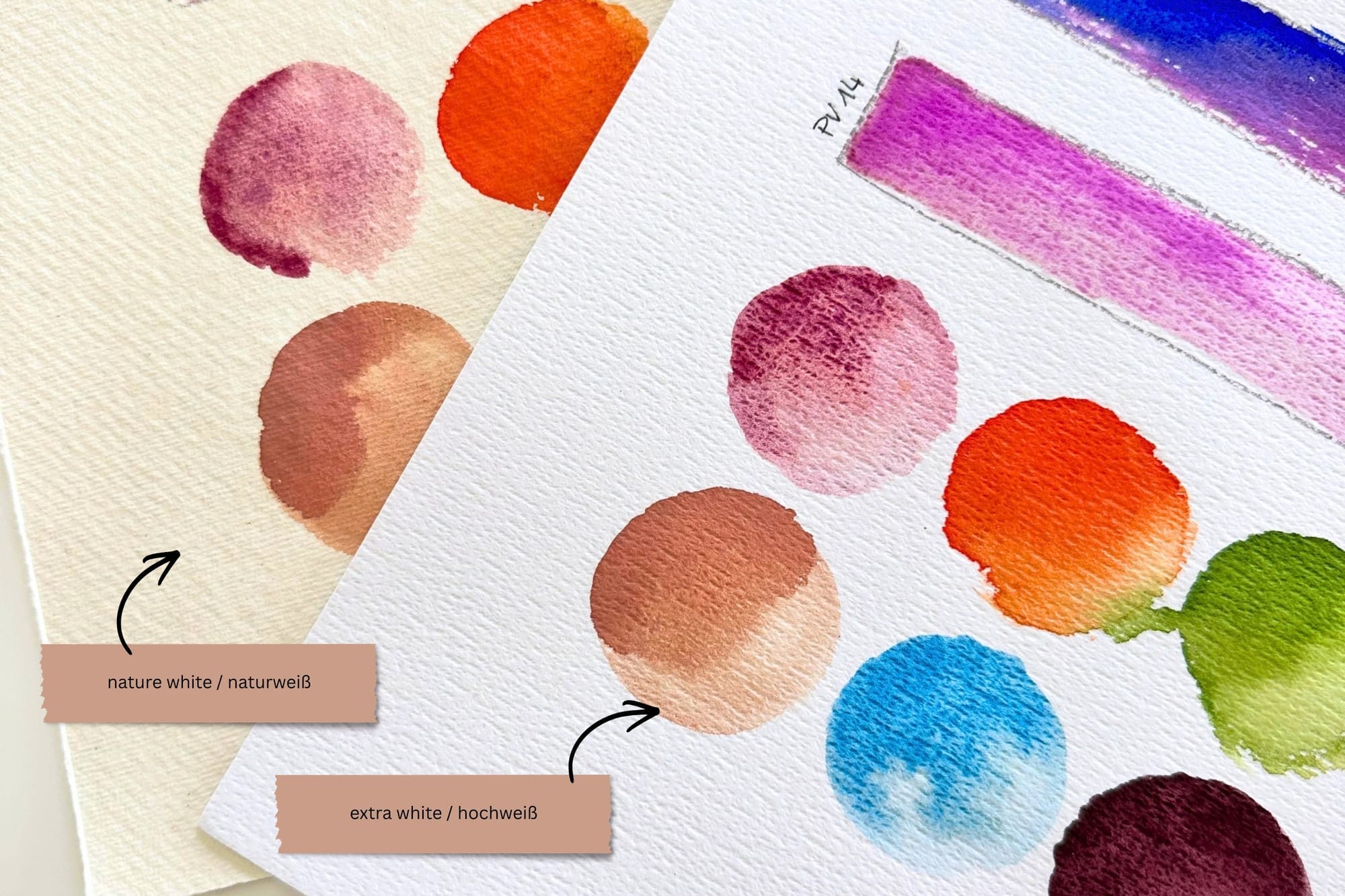
Finally the shade of white, which is often underestimated. Bright white paper makes colors appear especially radiant and full of contrast, and that is exactly why I prefer it. My pinks, violets and greens come across most clearly on it. Natural white paper, by contrast, looks warmer and softer and takes some of the luminosity away from the colors. In the end that is a matter of taste. For my style, though, the white may well be as bright as possible, ideally with no yellow cast at all.
How I Choose My Paper
There is no perfect paper, there is only the right one for whatever I have in mind. For me that almost always means a fine surface, a white that is as bright as possible without a yellow cast, cotton for the painting sessions and cellulose for everything else. Hot pressed and torchon play hardly any role in my everyday work, the one is too smooth for me, the other too rough. How great the differences really are shows most clearly on the swatch sheets here in the article, where the same colors lie side by side on the different papers. In the end it is worth choosing the paper just as deliberately as the color, rather than simply reaching for the nearest sheet.