The Swatch Card and Color Wheel for Green Gold – Why a Single Pigment Mixes Cleaner Than Its Blend
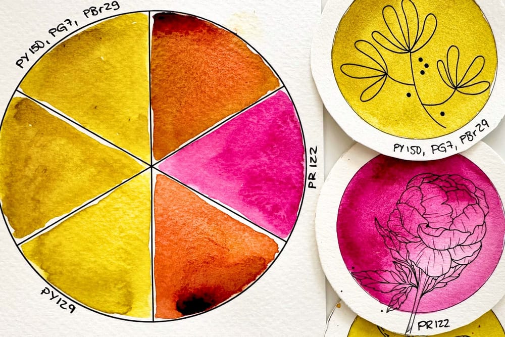
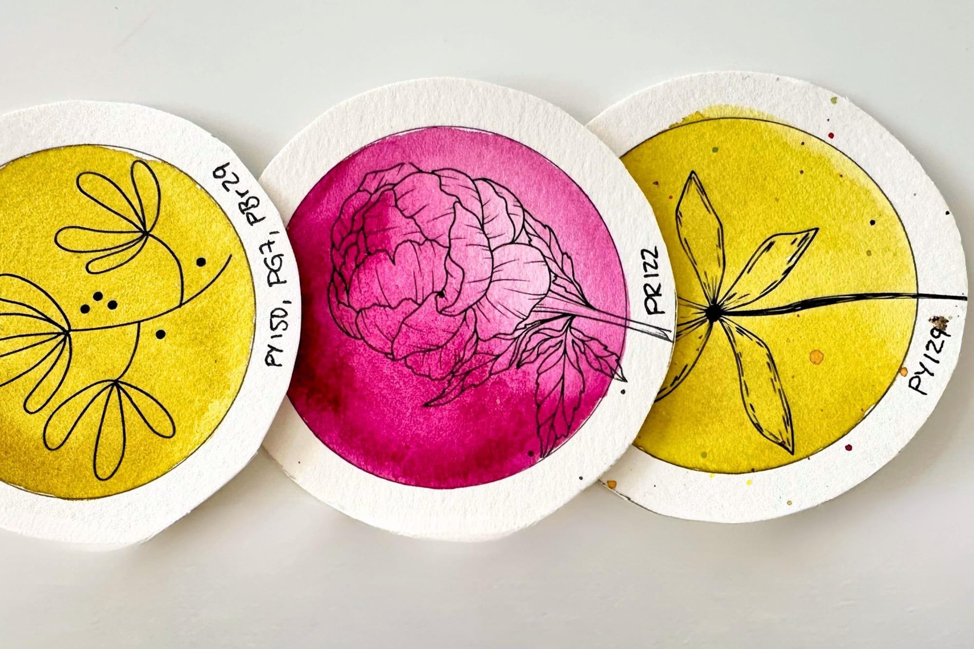
Green Gold is one of my favorite colors, a luminous yellow green with a golden shimmer that I reach for in almost every leaf painting. This Green Gold exists as a pure single pigment called PY129, and at many brands additionally as a ready-made blend of several pigments. On the swatch card the two lie side by side, almost impossible to tell apart. The exciting question, though, is not how a color looks on its own, but how it behaves the moment I mix it. That is exactly what I looked at this month on the color wheel.
The Pure Pigment PY129
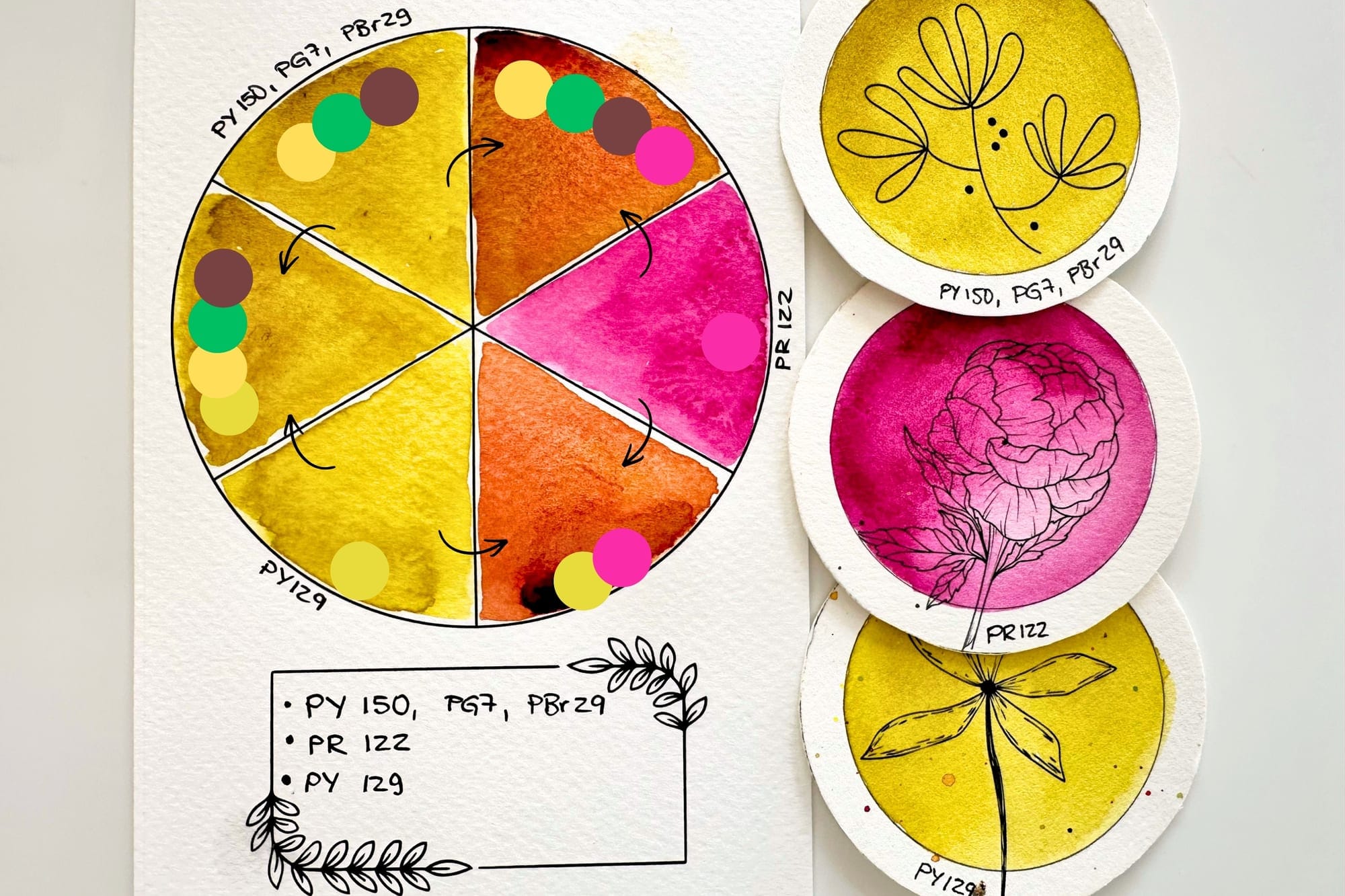
PY129 is a single pigment. It always brings the same clear base color and reacts calmly and predictably in mixtures. When I combine it with my magenta PR122, a rich, medium orange appears on my card. The result stays fresh and bright, because only two clear color directions meet, the yellow green and the pink.
The Ready-Made Blend
The second version carries the same name but is built quite differently. Here Green Gold sits in the pan as a blend of PY150, PG7 and PBr29, that is of a clear yellow, a strong phthalo green and a brown. As long as I use this color on its own, it looks deceptively similar to the pure pigment. Its true character only shows once a fourth color joins in.
What Happens on the Color Wheel
Here it gets interesting. When I mix the ready-made Green Gold blend with the same magenta PR122, an orange appears as well, but it turns out a shade more muted and earthy than with the pure pigment. The reason lies in the individual components. The phthalo green PG7 pulls toward violet and grey with PR122, while the yellow PY150 pushes the mixture further into orange. Both forces work against each other, and that takes some of the luminosity out of the tone.
To be honest, I had imagined the difference to be bigger. In pure theory the blend should tip much more clearly into grey brown. In practice, however, the strong yellow keeps the upper hand, so that in the end both sides give a perfectly usable orange. The difference is there, it is just finer than color theory would suggest.
Why This Matters to Me
For me this is a lovely example of why it is worth knowing the pigments in your own paints. Two colors can look identical on paper and still behave completely differently when mixed. A single pigment stays predictable, while a blend can shift in ways you would not expect from the pure color. That is why, for especially bright and clear mixtures, I like to reach for single pigments, even if the difference in everyday painting sometimes turns out smaller than the theory promises. Anyone who loves working with greens will find more on this in my article about the perfect green, and why most of my favorite colors are single pigments I have written down in my perfect color palette.
At a Glance
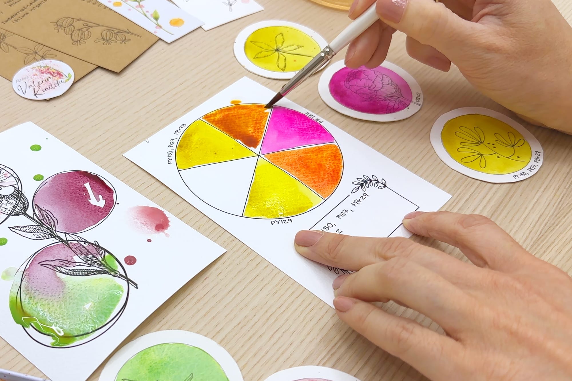
On this month's swatch card and color wheel both versions lie directly side by side, the pure PY129 and the blend, each joined with magenta. Side by side you do see it after all. The pure pigment stays a little clearer and brighter in the orange, while the blend looks a touch calmer and warmer. For me that is exactly the kind of small proof that trying things out always pays off, because in the end the colors so often give their own answer. How this month's swatch card and color wheel come together step by step can be followed in the free painting session for the swatch cards.