The Swatch Card and Color Wheel for the Wild Carrot – How Green and Violet Play Together
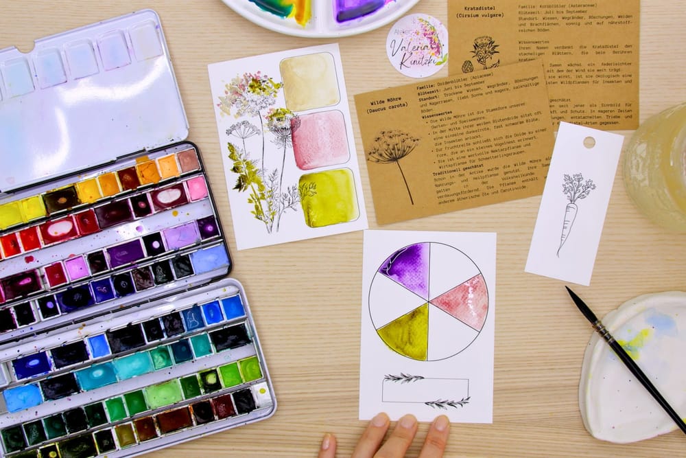
My September package again holds two small tools beside the motifs, ones that let you truly get to know your colors: a swatch card and a color wheel. The motif of the month is the wild carrot, with the spear thistle running alongside it — two plants that look unassuming at first glance and still open up a whole world in the paint box.
The palette for it is small: a few pure colors and a few mixtures, and it needs no more than that. Its real secret is a pair that seems to contradict itself at first glance and yet belongs together beautifully, namely green and violet.
The swatch card with its three fields
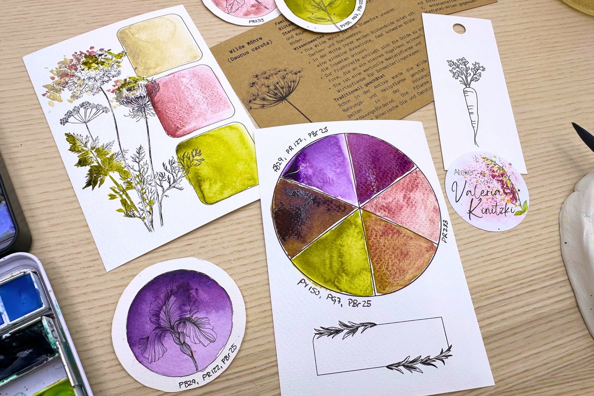
A swatch card, for me, is a profile of every color. Only once I have seen a tone applied, diluted and dried do I really know how it behaves. On the wild carrot card there are three fields, and each one carries a tone of the plant.
Two of them are pure pigments: a soft, milky pale, PW6:1, for the creamy-white veil of the flower umbel, and a delicate, dusty pink, PR233, the one they call Potter’s Pink, for the single dark floret at the heart of the umbel and the rosy touch the carrot takes on as it fades. The third field is a mixture, a quiet green from PBr7 and PG17, for the finely feathered foliage. Three tones, and the whole plant already stands on the paper.
The color wheel
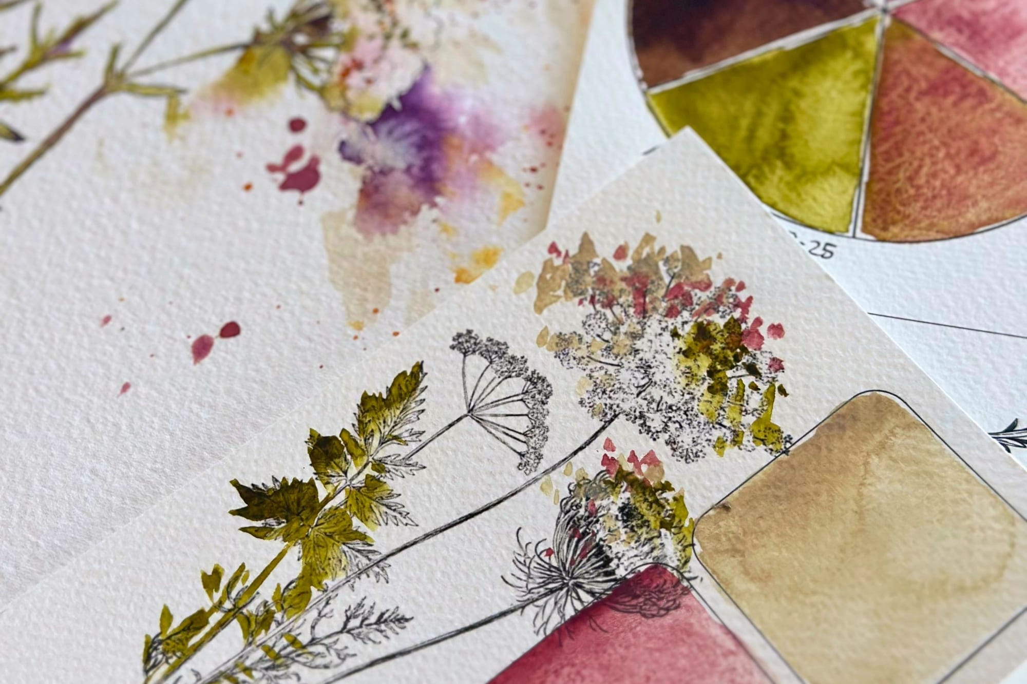
I love the little color wheel with its six pie slices even more, because it shows something astonishing: from just a few tones a whole world of color arises. At its corners this time sit the Potter’s Pink, PR233, a deep violet from PB29, PR122 and PBr25, and a warm yellow-green from PY150, PG7 and PBr25. Everything that lies between them arises solely from their meetings. How I build this color wheel and lay out the swatch card step by step, I show you in the matching painting session in the Atelier.
Green and violet, a quiet pair
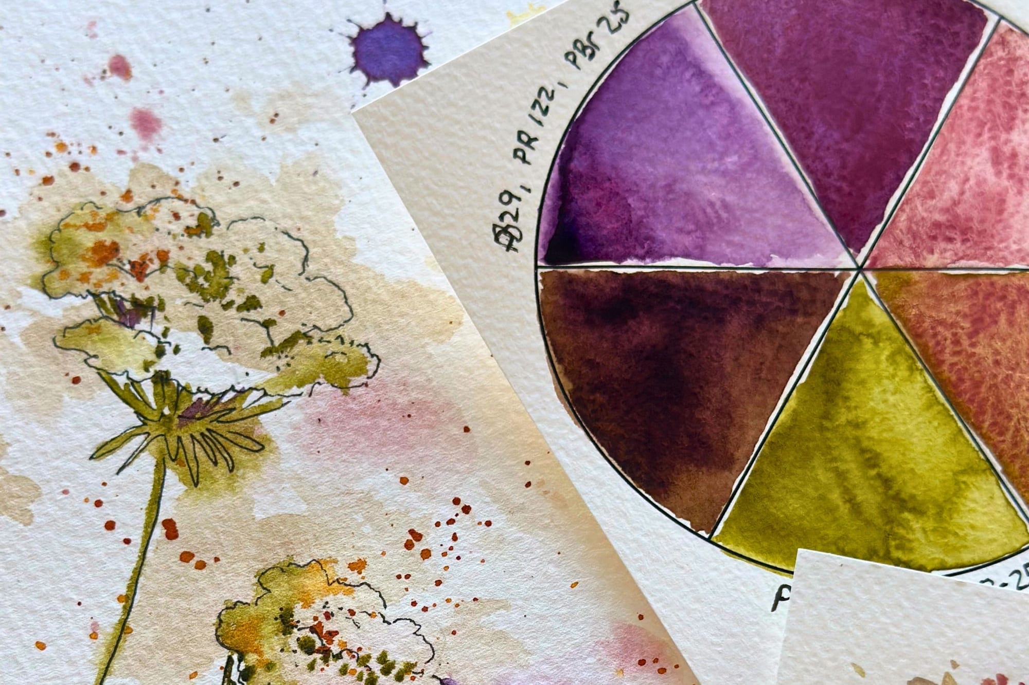
And here comes what delights me most about this palette. Green and violet form a lovely contrast; they sit almost opposite each other on the wheel and steady one another precisely because of it. At the same time both carry the same pigment within them, PBr25. That is why their meeting always stays warm and coherent rather than muddy, because a shared thread holds them together.
While painting the wild carrot I put exactly that to use, in two ways. The shadows on the stems I did not stir up as a finished brown, but glazed: first a layer of green, and once it had dried, a breath of violet over it. The shadow then settles quite naturally over the tone beneath and looks deeper than any single color could. And into the background behind the light, airy motif I laid violet, so the delicate plant gains depth and its green stands out clearly in front of it.
Why this belongs, for me
For me, this is the very heart of my work: that painting becomes an understanding and not a guessing. A small, coherent selection takes away the fear of mixing and creates harmony almost by itself, because all the tones are related to one another. That is why every package holds, alongside the motifs, this little piece of craft. Anyone who would like to turn the motif into something of their own will find the thistle folding card in the September package, and which colors live in my box for good, I have shown in My Perfect Color Palette.